
A UI/UX assignment aimed at COVID-19 relief
During the COVID-19 pandemic, The Pew Research Center details that more than one-in-five Americans (22%) mentioned economic difficulties resulting from the pandemic – either challenges they have faced themselves, or that others faced more generally.
Our assignment, which began mid-February and concluded in late March, was to create some sort of relief or aid in the form of an app or website for those who suffered under the pandemic. It was this statistic that my group and I came across during our research on how to tackle this, and was our central drive to creating Pecunia.
What is Pecunia?
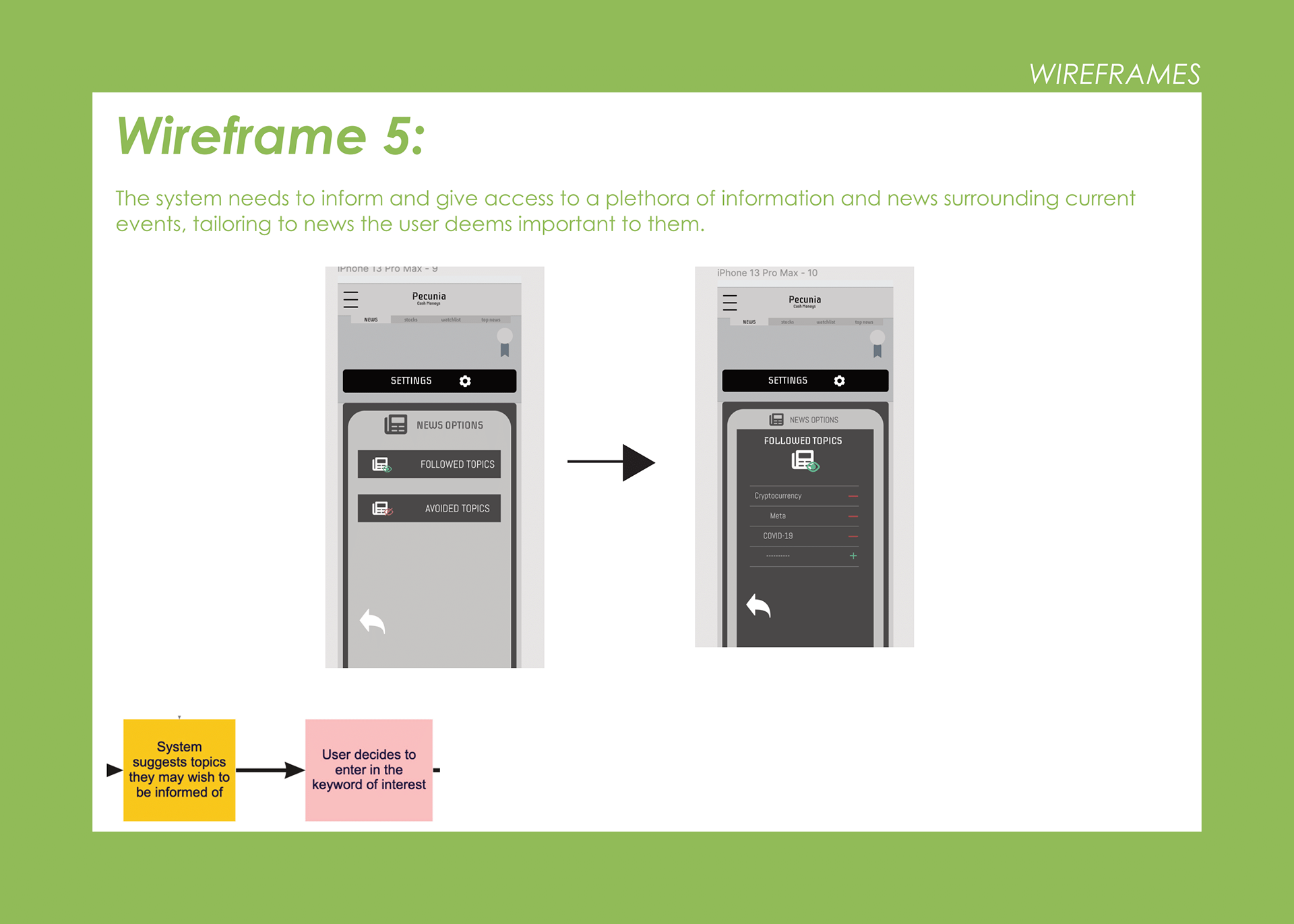
Pecunia is an app that brings together the streamlined, stylish ease of modern social media and the social community it fosters, and the financial world of asset management, stocks, crypto, and more. Pecunia communicates helpful information regarding users' investments and financial interests while learning what financial news to show the more the user interacts with what is important to them.
Why?
Learning to invest, and the idea of managing, and monitoring stock and one's financial portfolio can be a daunting task. It can be hard to go from a financial newbie to stock savvy, especially without a user-friendly method; Pecunia aims to be that method.
For Who?
Pecunia serves primarily those who have had financial difficulties, and those struggling to keep track of their finances in a COVID-19 world. As such, the app is suitable for any adult.
A.E.I.O.U
A - Activities are goal-directed sets of actions. What are the pathways that people take toward the things they want to accomplish, including specific actions and processes? How long do they spend doing something? Who are they doing it with?
For this, we boiled it down to:
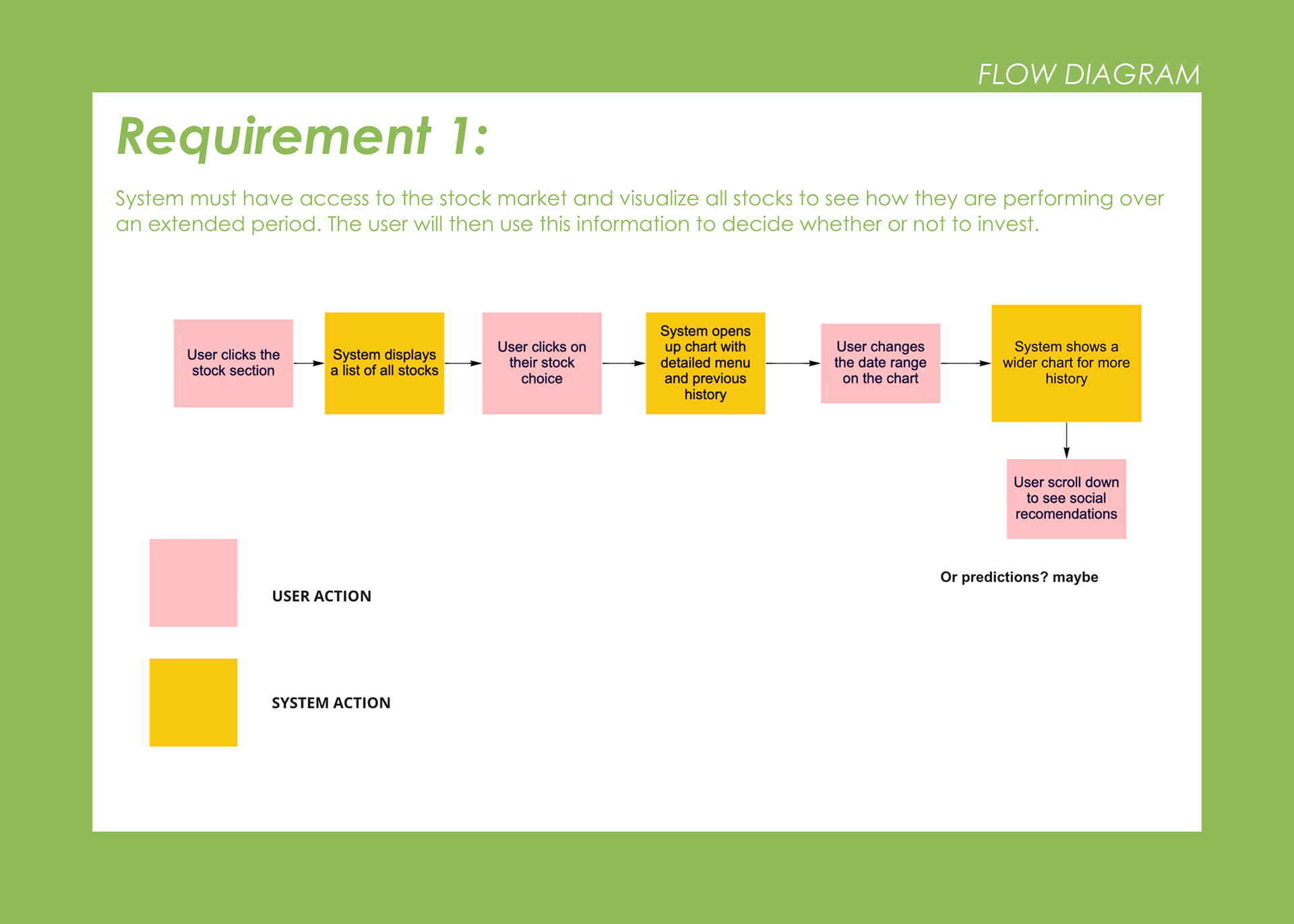
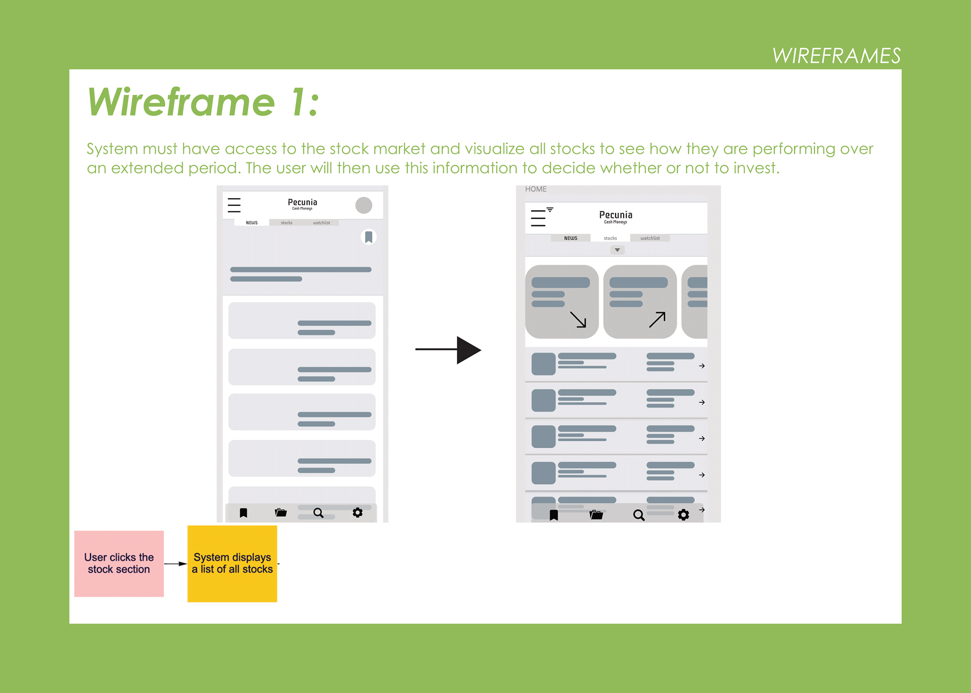
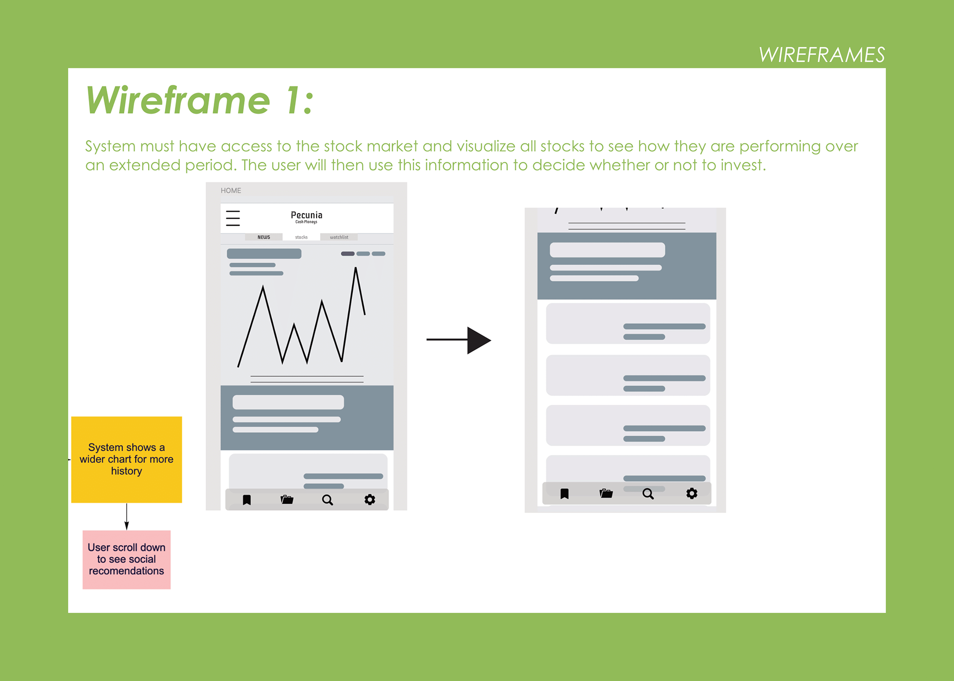
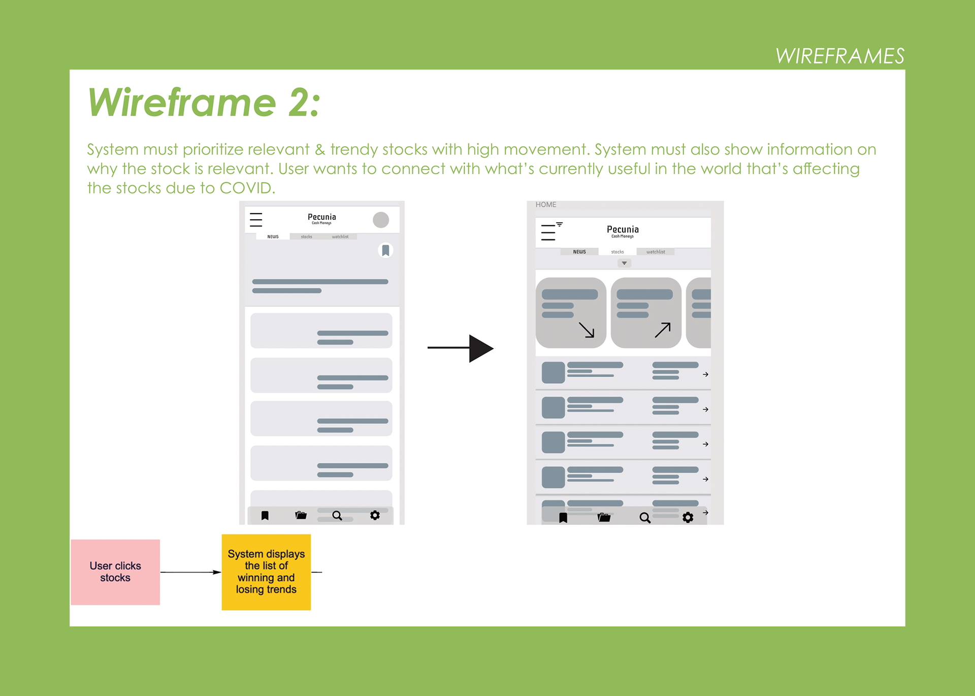
- Checking stock prices.
- Viewing positive and negative trends.
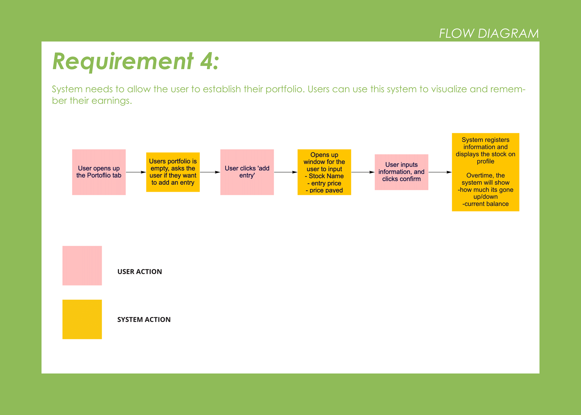
- Organizing Finance portfolio.
- Setting up a watchlist.
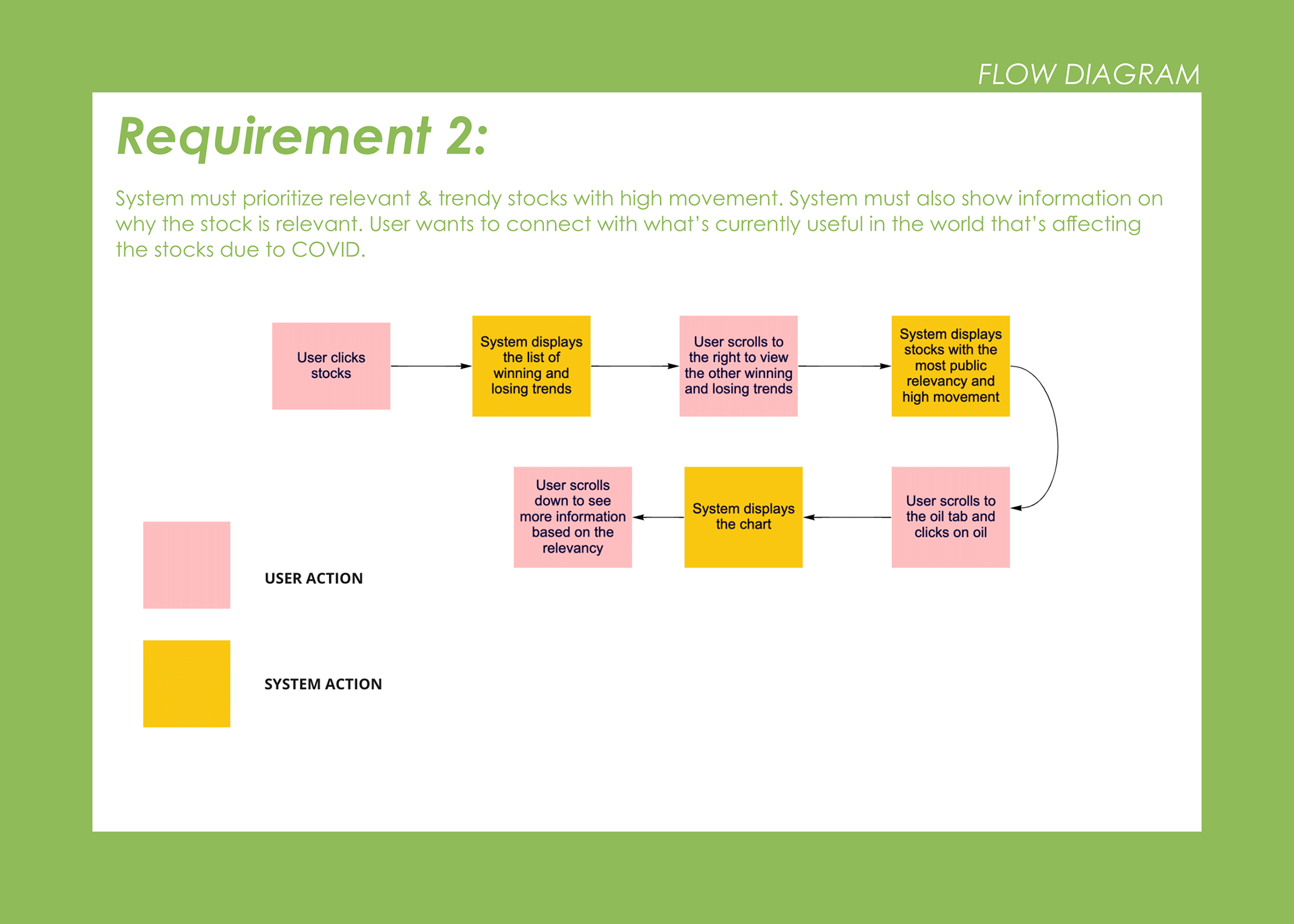
- Showcasing news related to Stock/ COVID-19/Events related to finance.
- Viewing positive and negative trends.
- Organizing Finance portfolio.
- Setting up a watchlist.
- Showcasing news related to Stock/ COVID-19/Events related to finance.
E - Environments include the entire area where activities take place. For example, what describes the atmosphere and function of the context, including individual and shared spaces?
The perceived benefits of Pecunia planned from the get-go would be its mobility. Because of this, environments vary wildly, as one should be able to check from the comfort of their home, at their work, or on the go.
I - Interactions are between a person and someone or something else, and are the building blocks of activities. What is the nature of routine and special interactions between people, between people and objects in their environment, and across distances?
- Users reading, liking, and replying to posts of other people/influencers
- Reading articles and news related to their financial profile
- Checking stock charts, data, and daily trends noted by app
- Discovering interesting companies/brands/stock indexes to watch for, and saving to watchlist.
- Frequently checking and updating their portfolios.
- Replying to messages, and chatting with others with related interests/in similar fields.
O - Objects are the building blocks of the environment, key elements sometimes put to complex or even unintended uses, possibly changing their function, meaning and context. For example, what are the objects and devices people have in their environments, and how do these relate to their activities?
Objects outside of one's mobile device, be it a phone or tablet, would scarcely be needed. This is due to Pecunia being a mobile app, ensuring one can check their finances from anywhere.
U - Users are the people whose behaviours, preferences, and needs are being observed. Who is present? What are their roles and relationships? What are their values and prejudices?
Pecunia is an app that revolves around the ease of managing stock portfolios and finance information. Because of this, its primary demographic would be adults, both younger and older, who seek financial stability. This adult audience base also encompasses those who are generally unfamiliar with the field of stock, and wish for an easy-to-understand alternative.
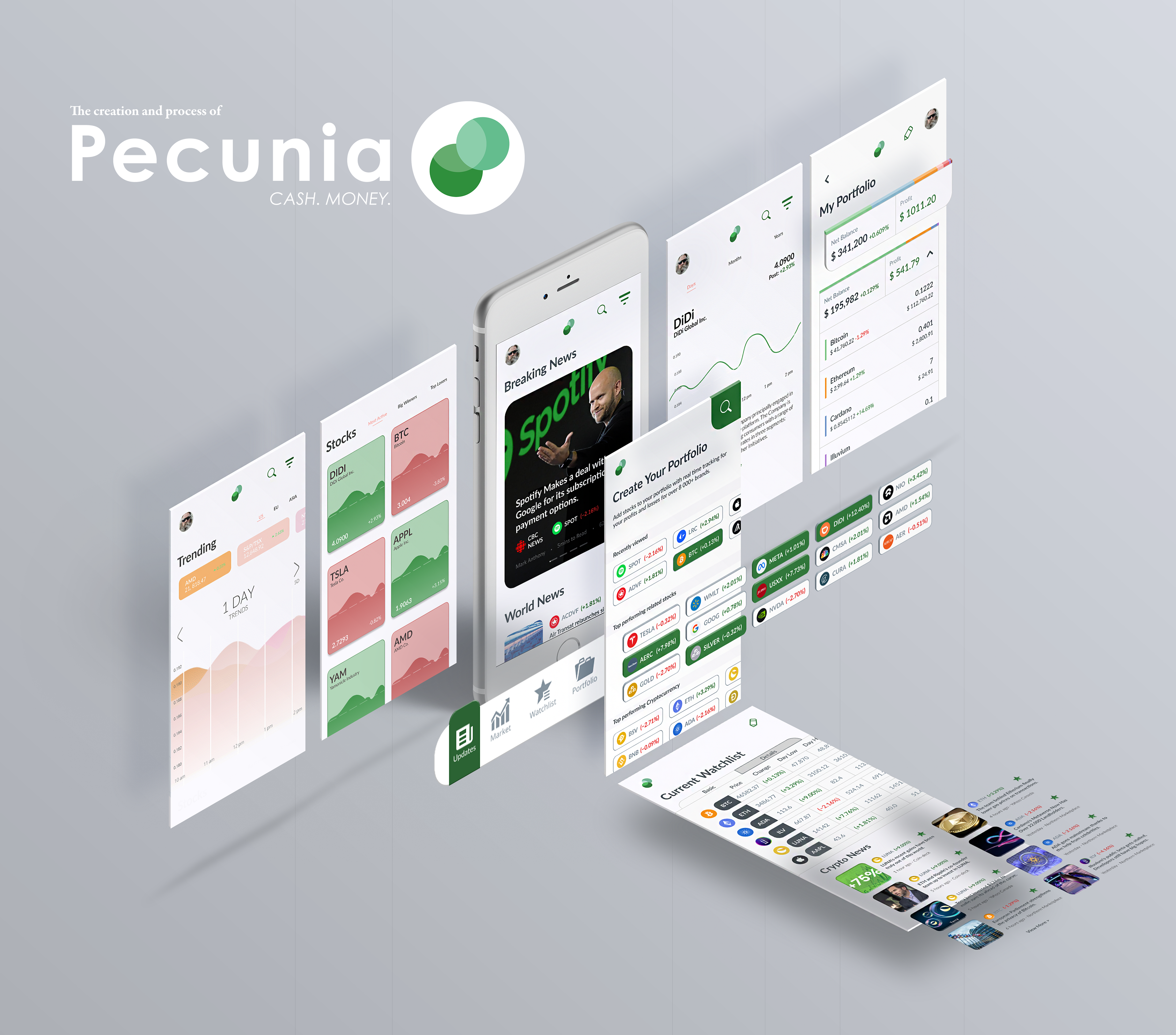
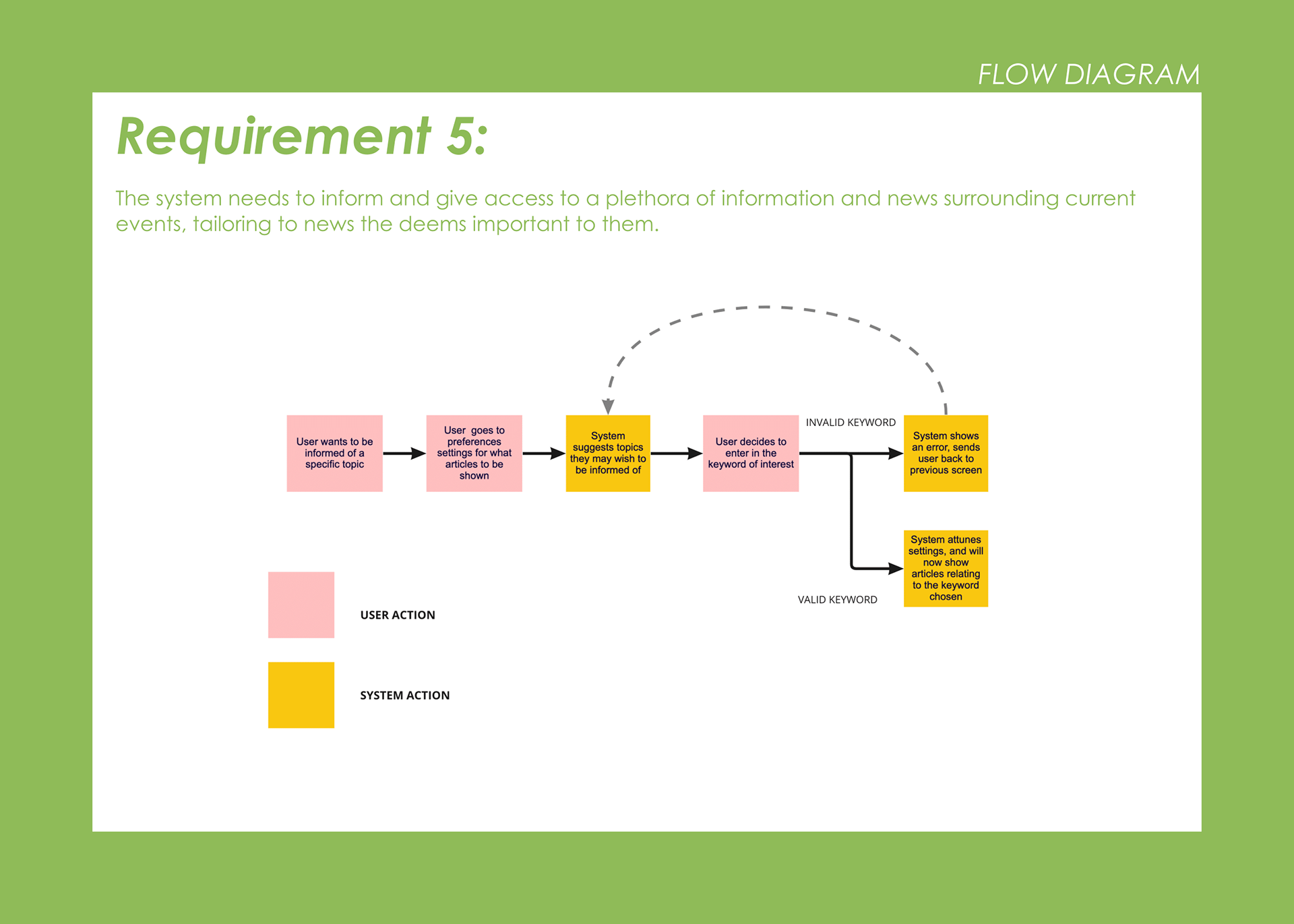
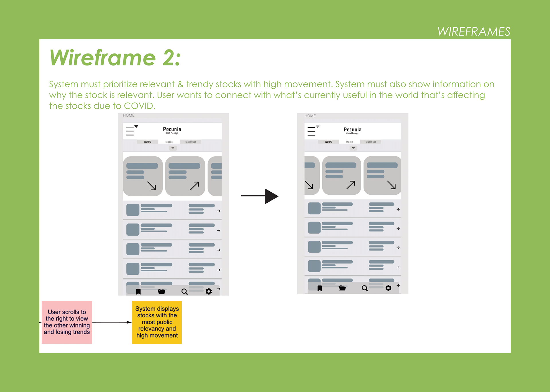
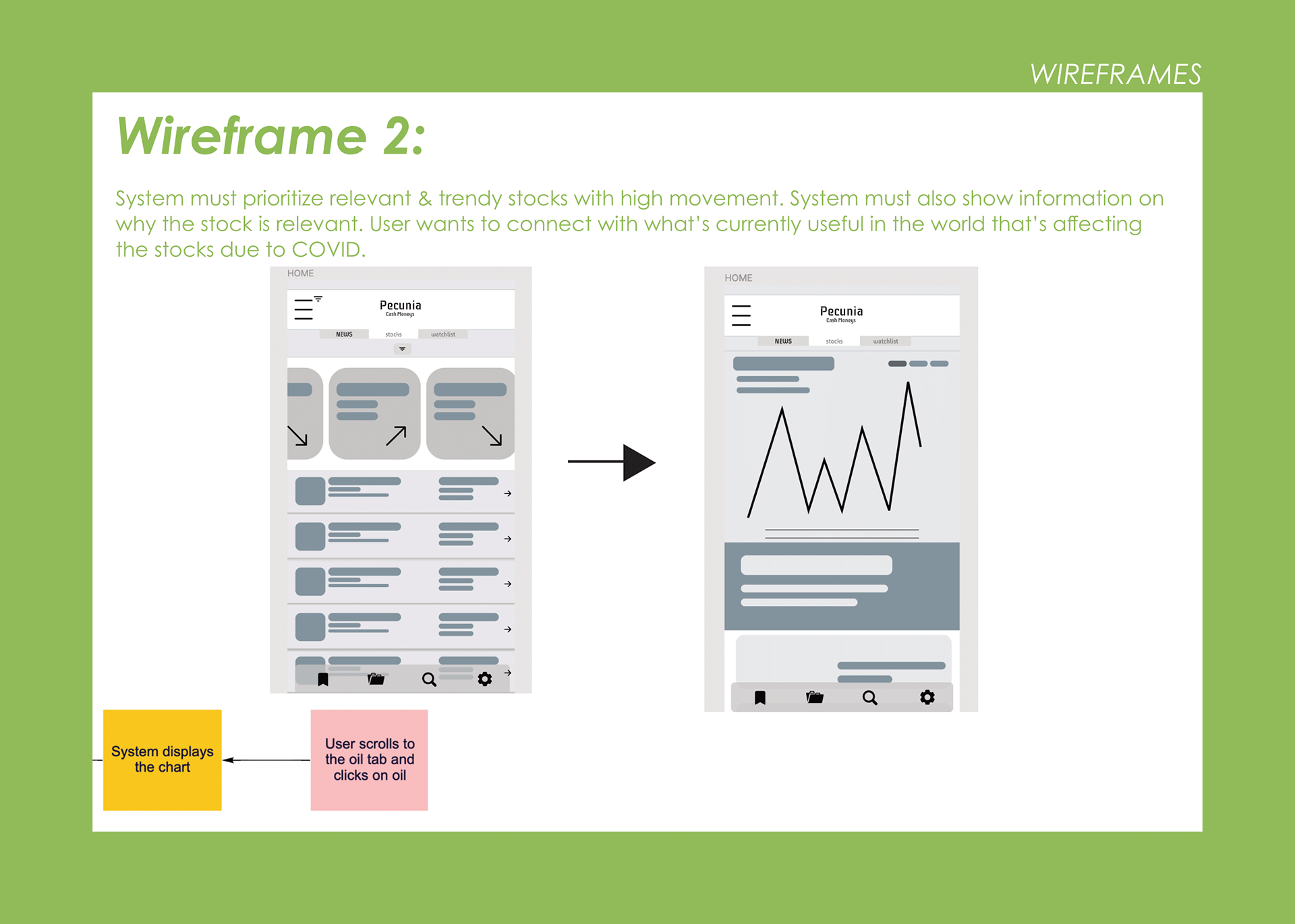
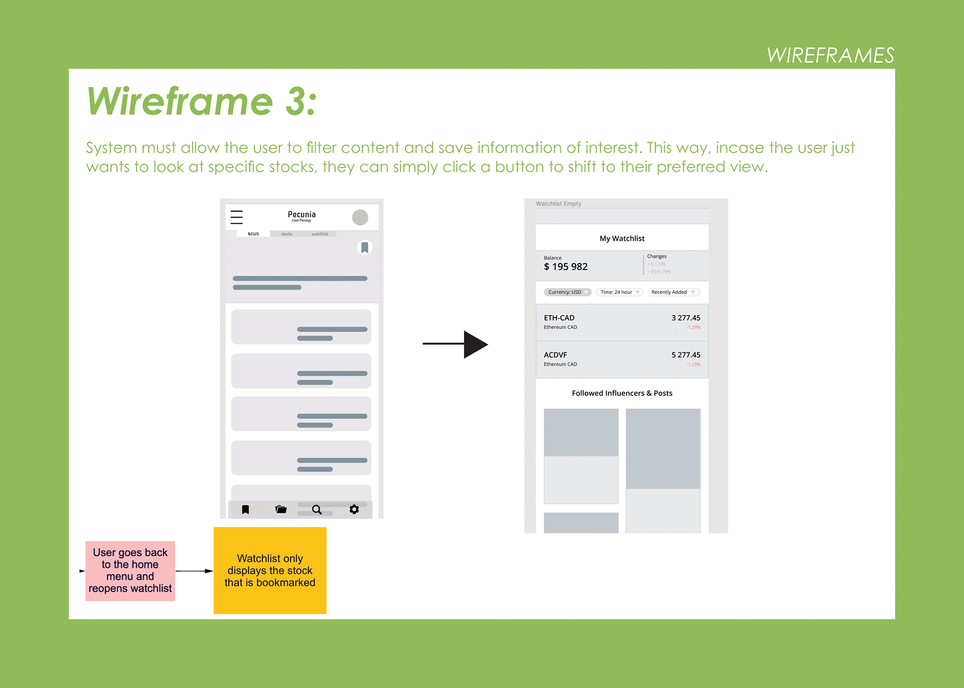
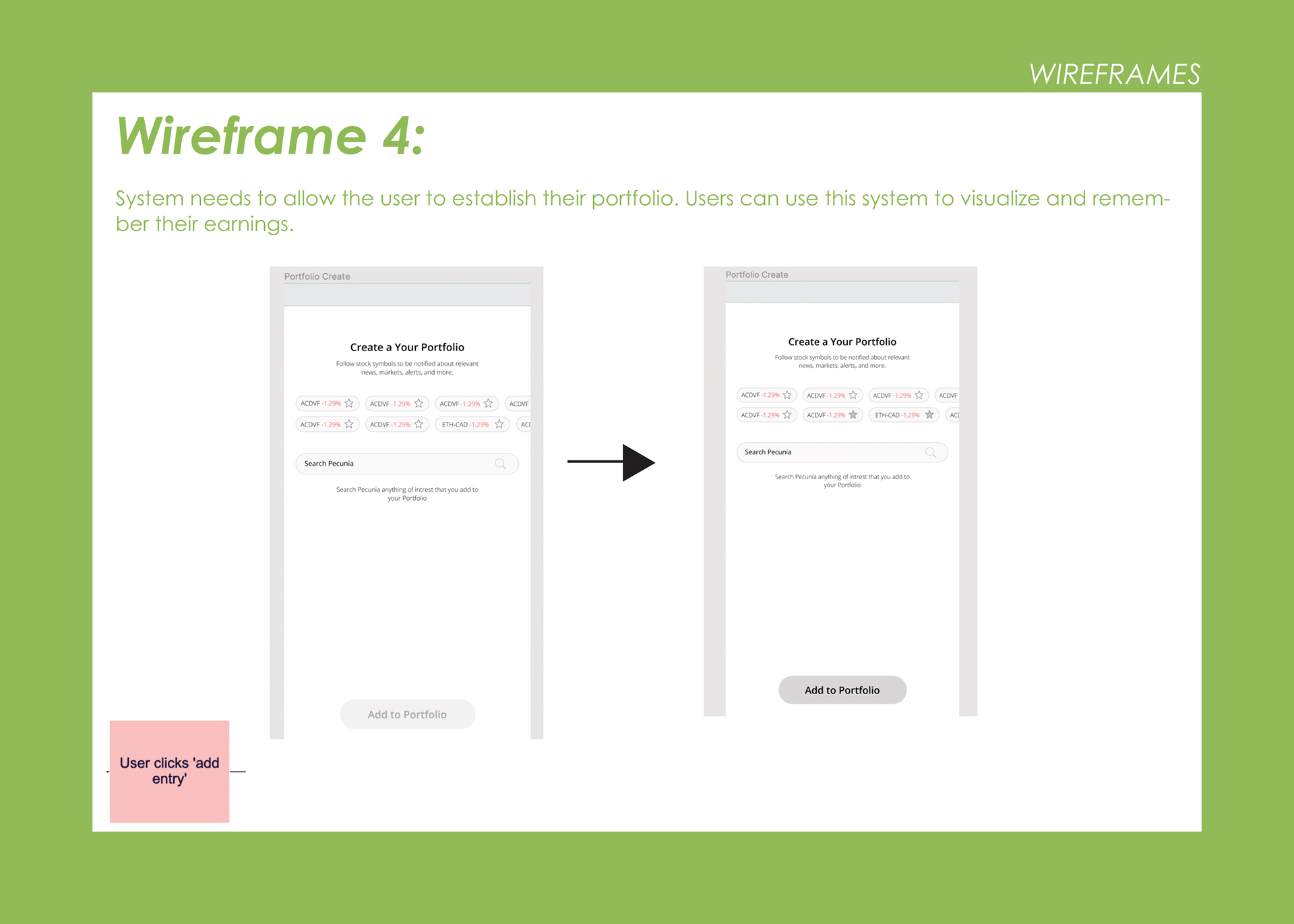
Through the A.E.I.O.U we completed, we were able to develop 5 task flow charts revolving around specific requirements. These would be specific routes users would take when using Pecunia, and would feed directly into the creation of our wireframes


A bit of debating on our overall theme and presentation began to occur naturally as we expanded our wireframes and moved from ideating to visualizing through higher-fidelity wireframes.
We ended up settling with a white-green accent for our colour scheme, with a strong focus on simplicity to not overwhelm the user with details.


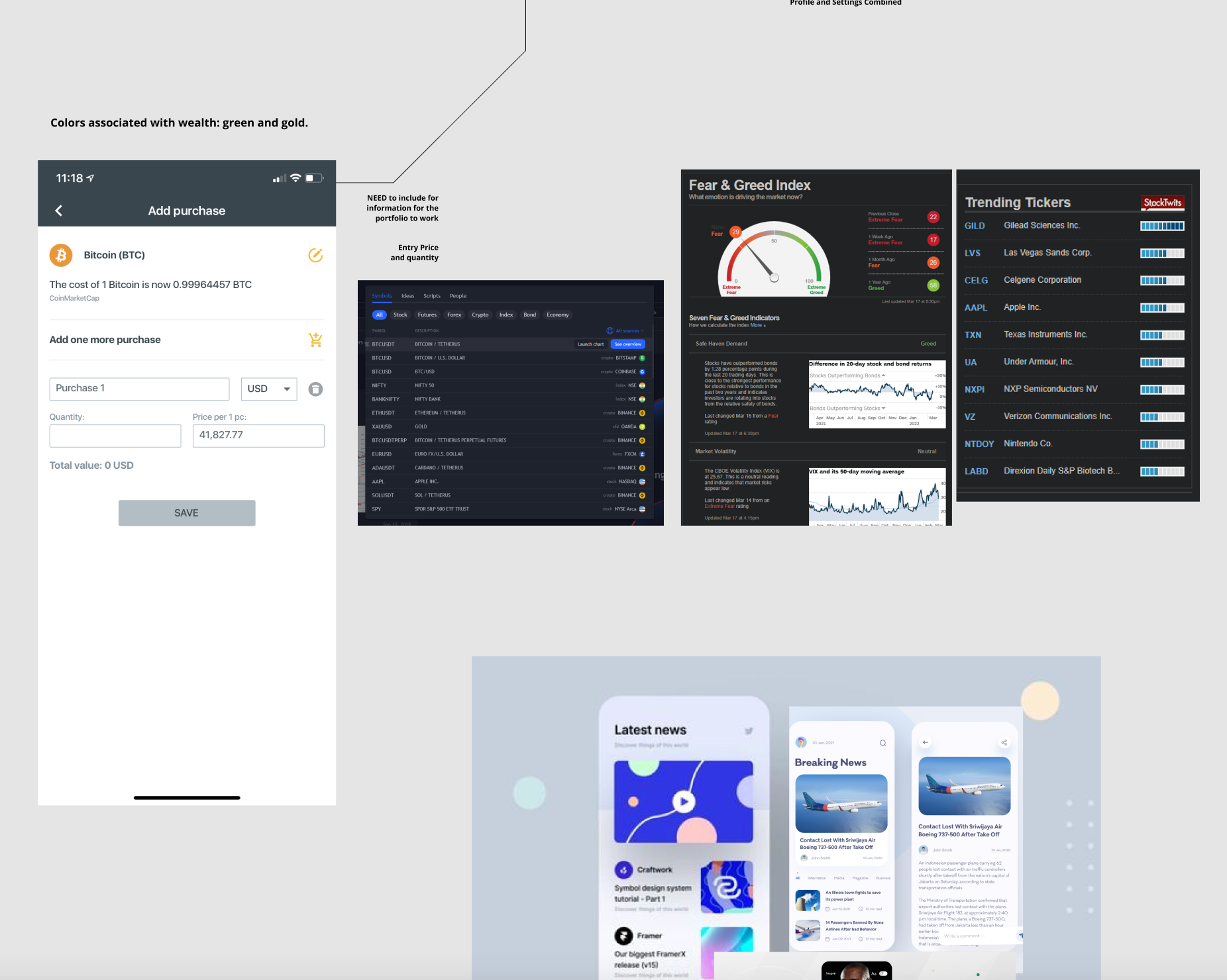
This simplicity and user-friendly ideology would follow us into our logo, which comprises three circles, two being the various greens and one white; a simple logo, unintricate and approachable. Greens like this would be used generously throughout our wireframes as we update them, indicating riches and money in its simplest form, with their friendly vibrancy never feeling too daunting.


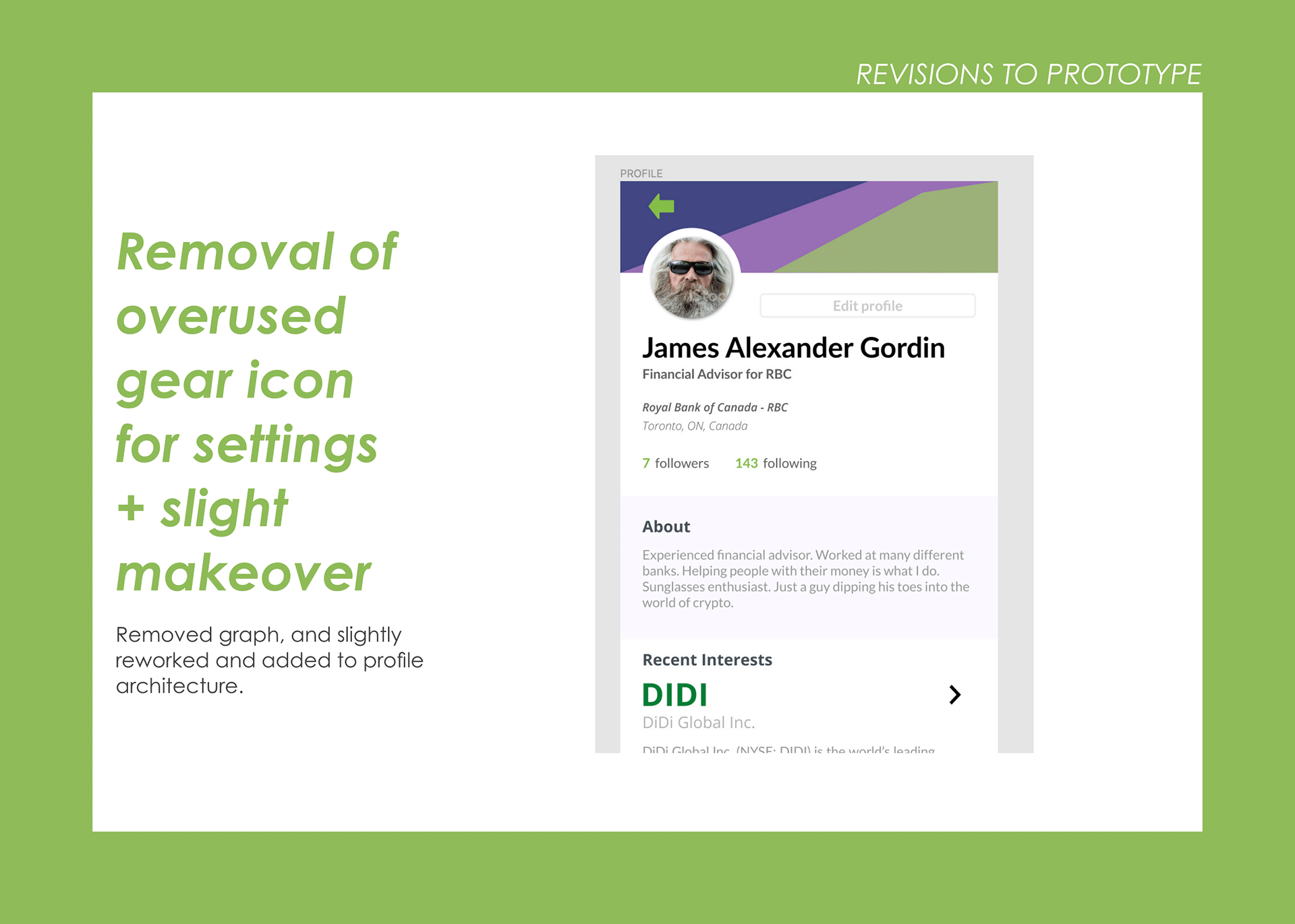
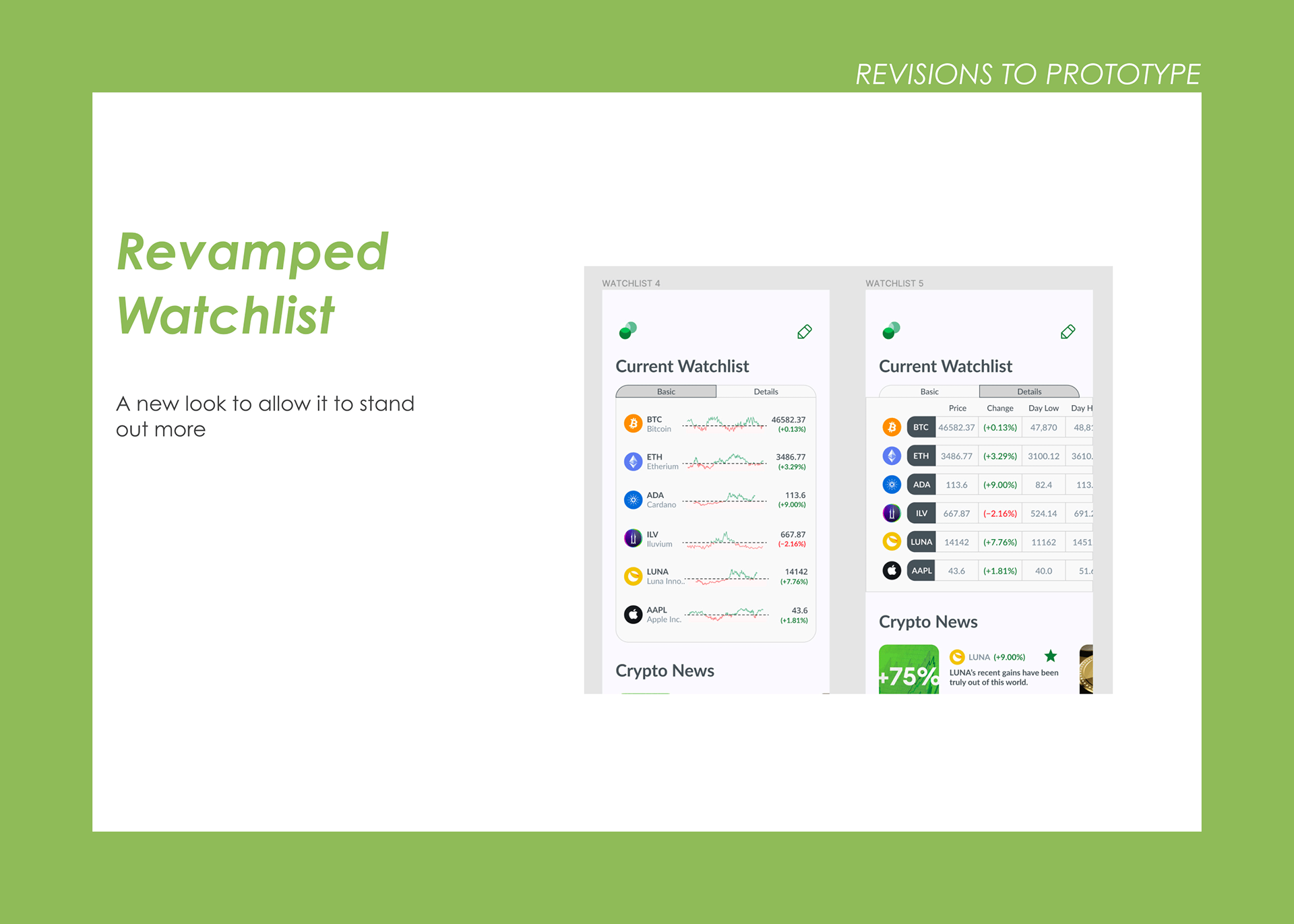
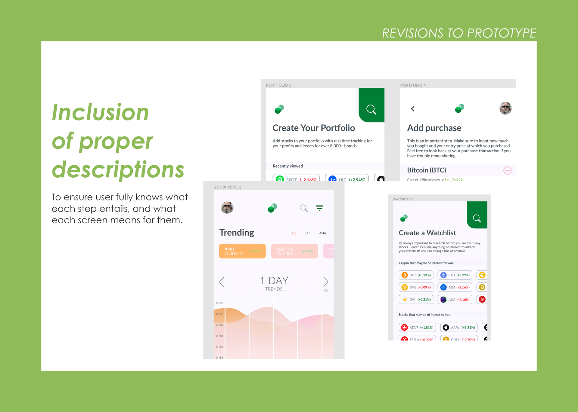
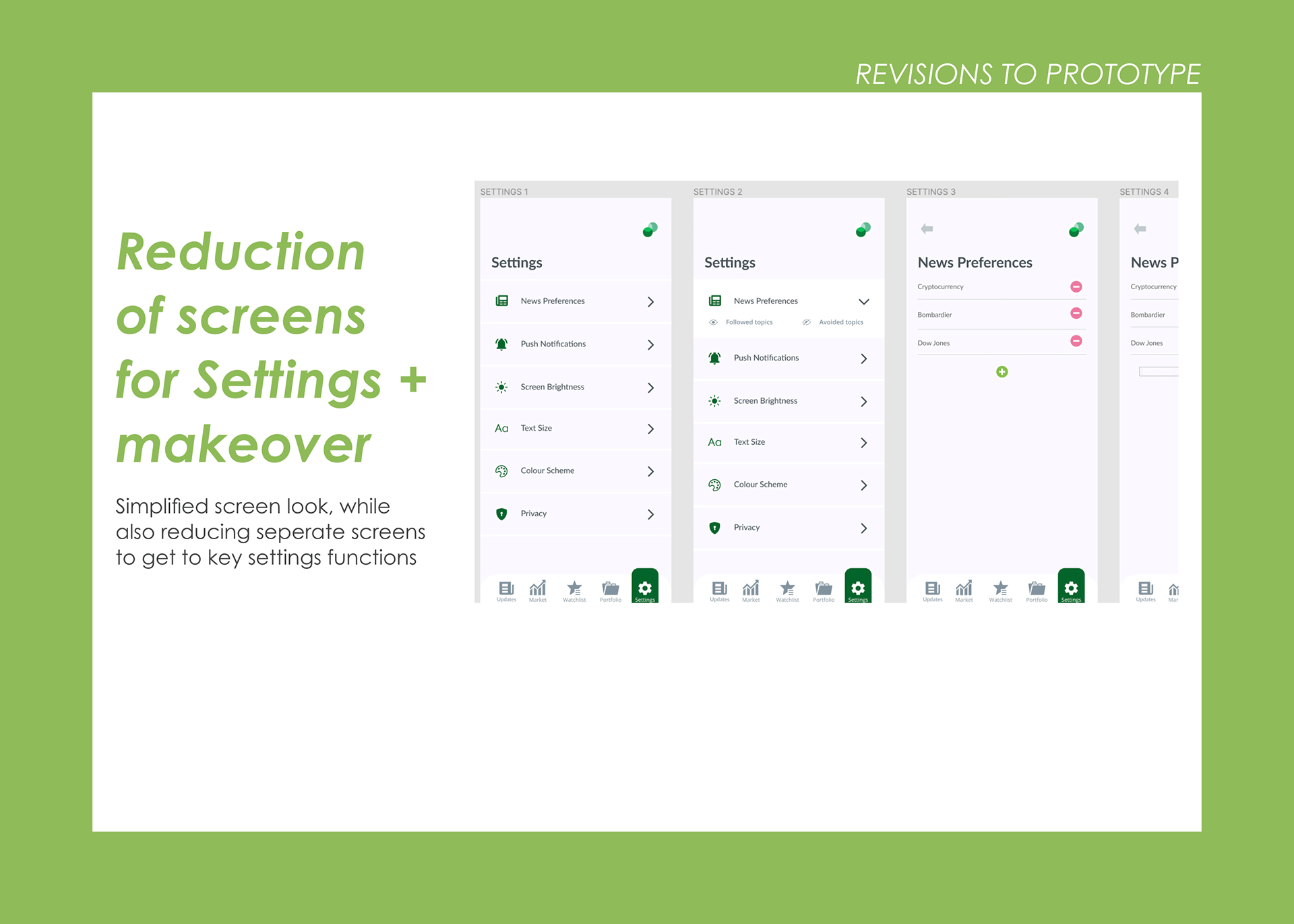
A variety of changes were made as we closed in on the assignment's end date. Updates across the board to ensure ease of use, understanding, friendliness, and professionalism hit every screen and flow as we approached our high-fidelity prototype.
Note: The prototype works best in full-screen mode.
The End Result
I cherish both the end result of this assignment and its process. It allowed me the opportunity to work with brilliant minds who brought invaluable commentary and ability to every work session and meeting. Despite the trials and tribulations that set us back, our team expertly experimented and collaborated, and my peers have taught me much through their design ethics, professionalism, and fantastic capabilities. Dylan Fleuelling and Justin Correia are both people whom I look forward to potentially working with again someday.
I feel my team's biggest shortcoming was our slight difficulty in handling the short, 5-week timeframe that hung over us each step of the way. It shortened and hastened certain processes in the very first and last stages of development I would have preferred to receive more love. Nevertheless, this assignment has taught me much about the ways of collaborating and creating both in and outside Figma.