
This assignment entailed the creation of an e-ticket, catalogue and poster design for a festival of my choice. I chose Reno, Nevada's annual Off Beat Music Festival, a multiple day festival showcasing local bands at various bars that takes over the street.
A musically rowdy event showcasing the local music scene, I wished to encapsulate the boisterous vibe that came with bouncing around from venue to venue, as well as the various genres of music flowing about the festival.
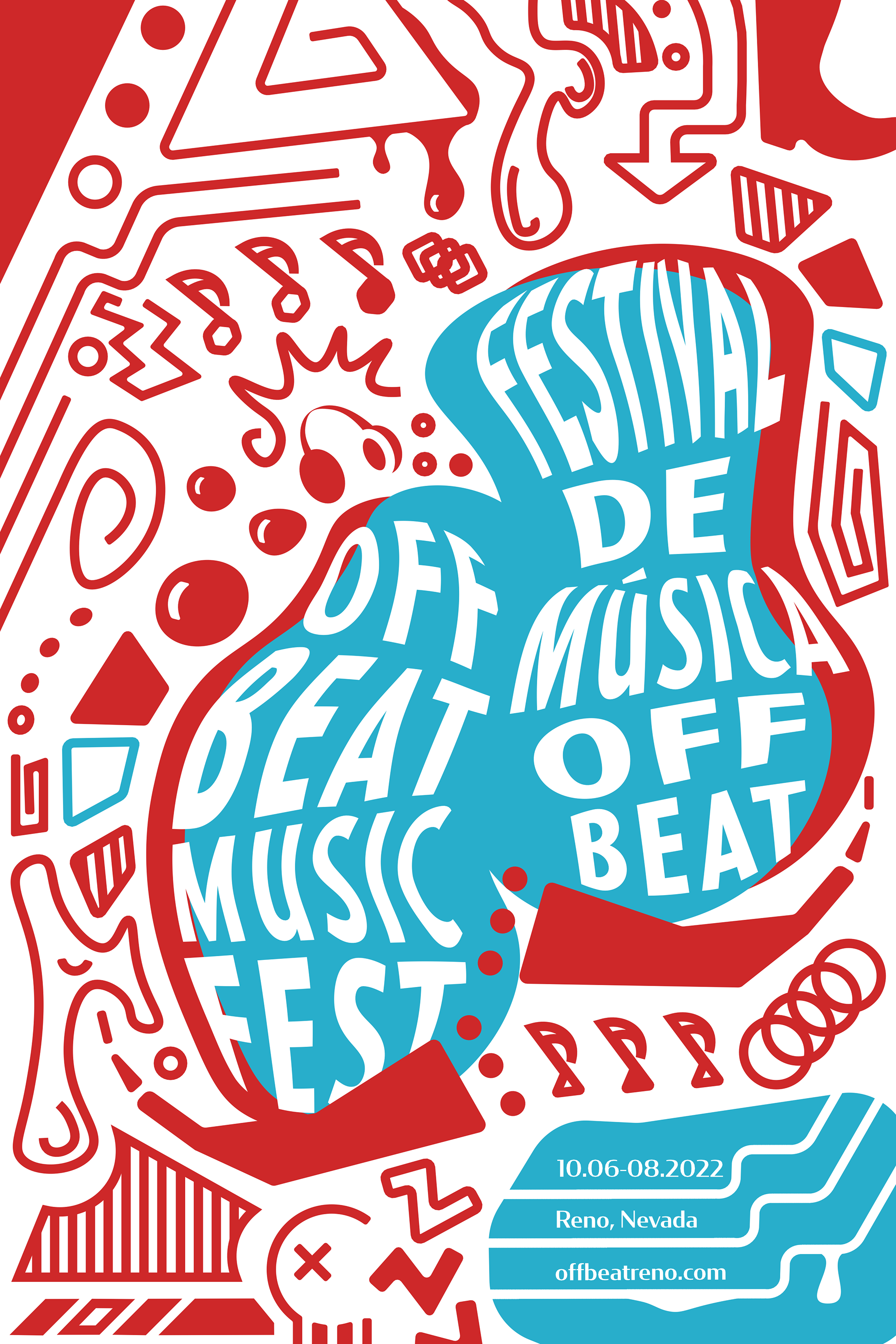
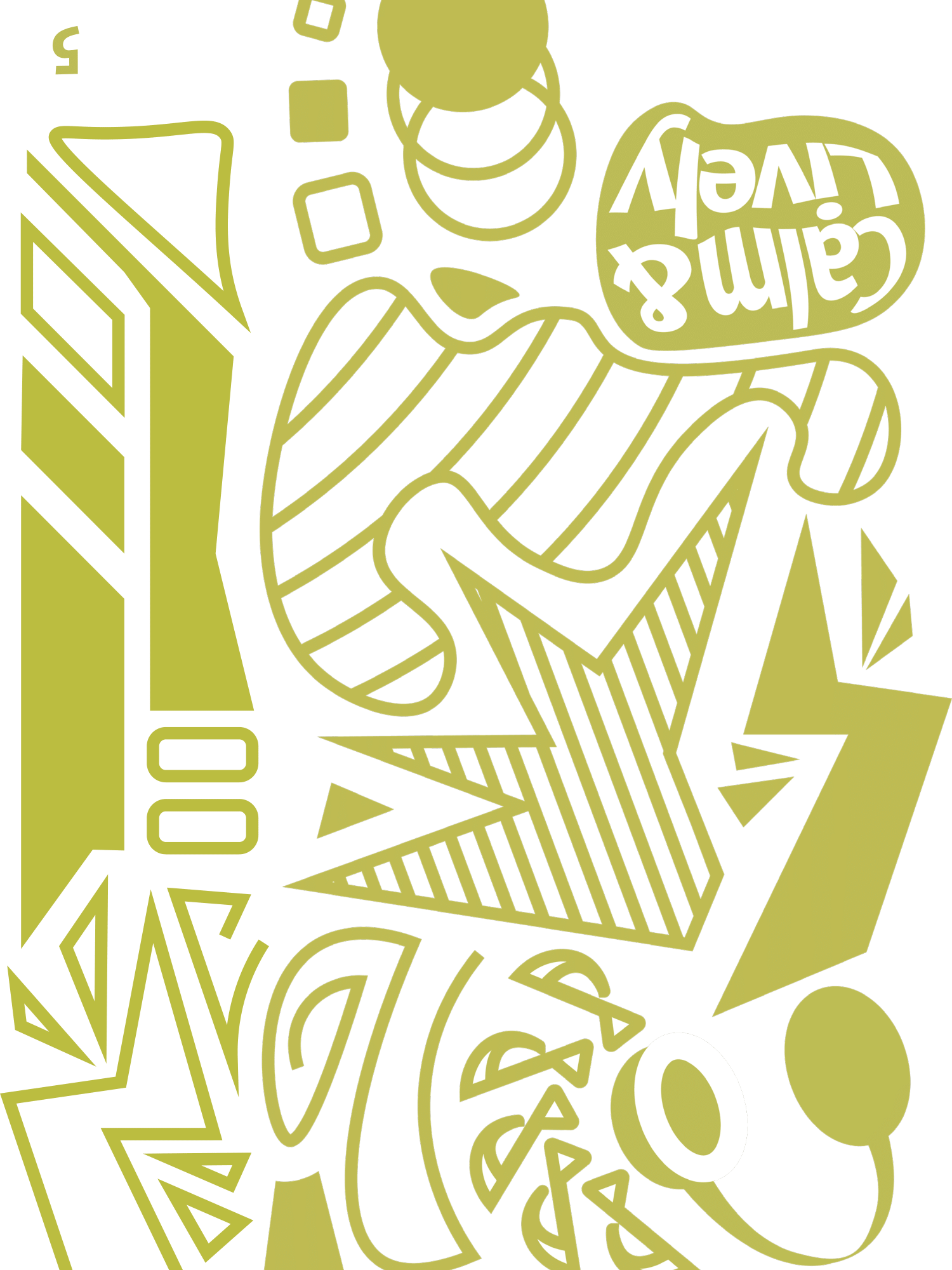
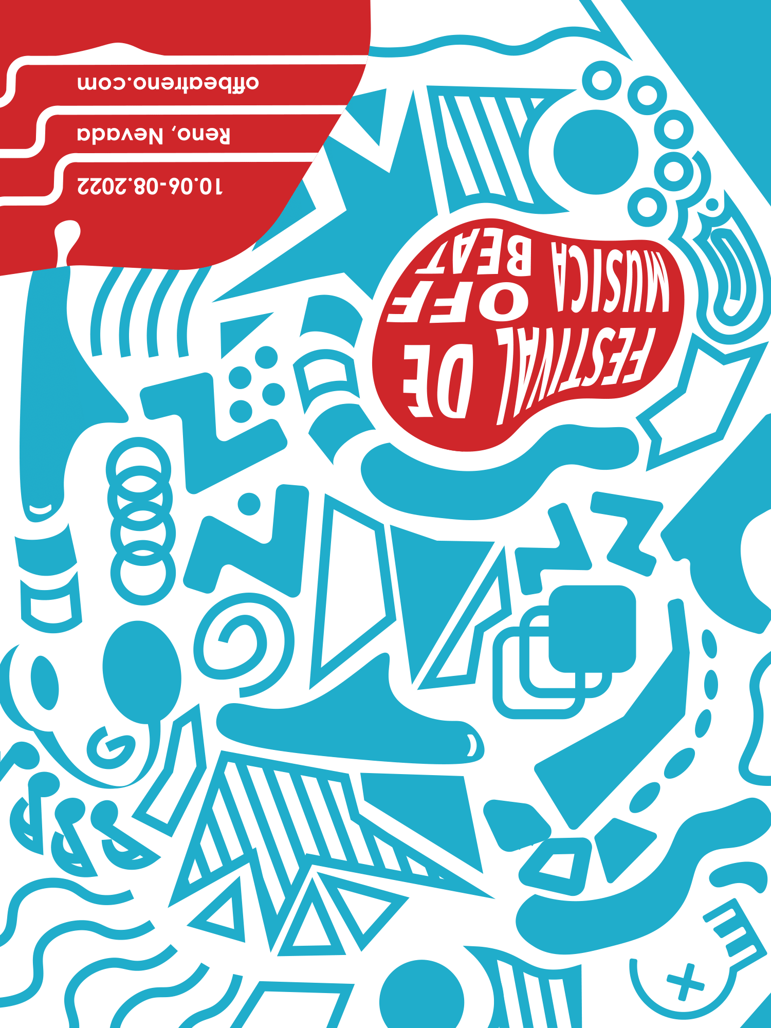
Finished poster.
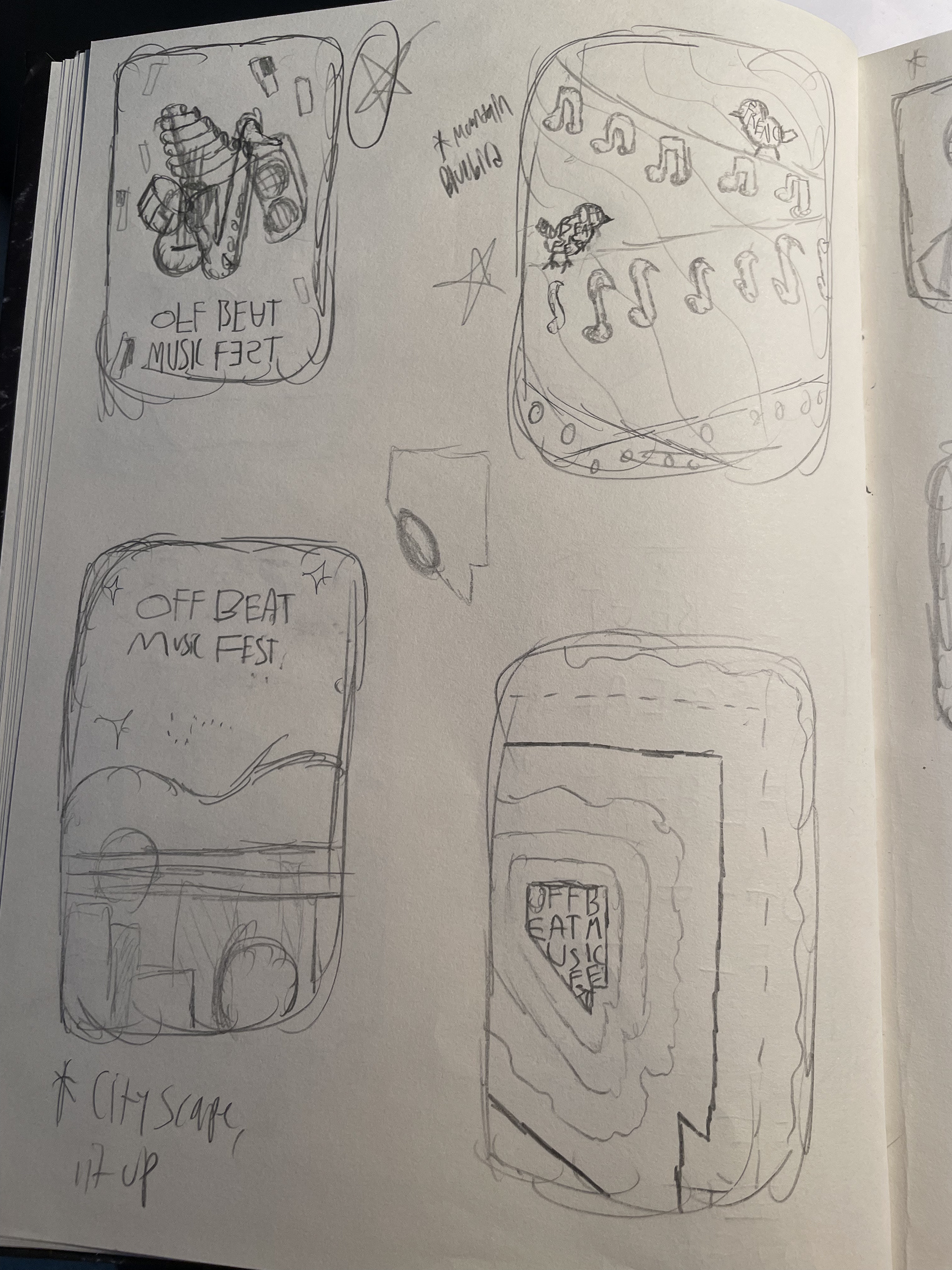
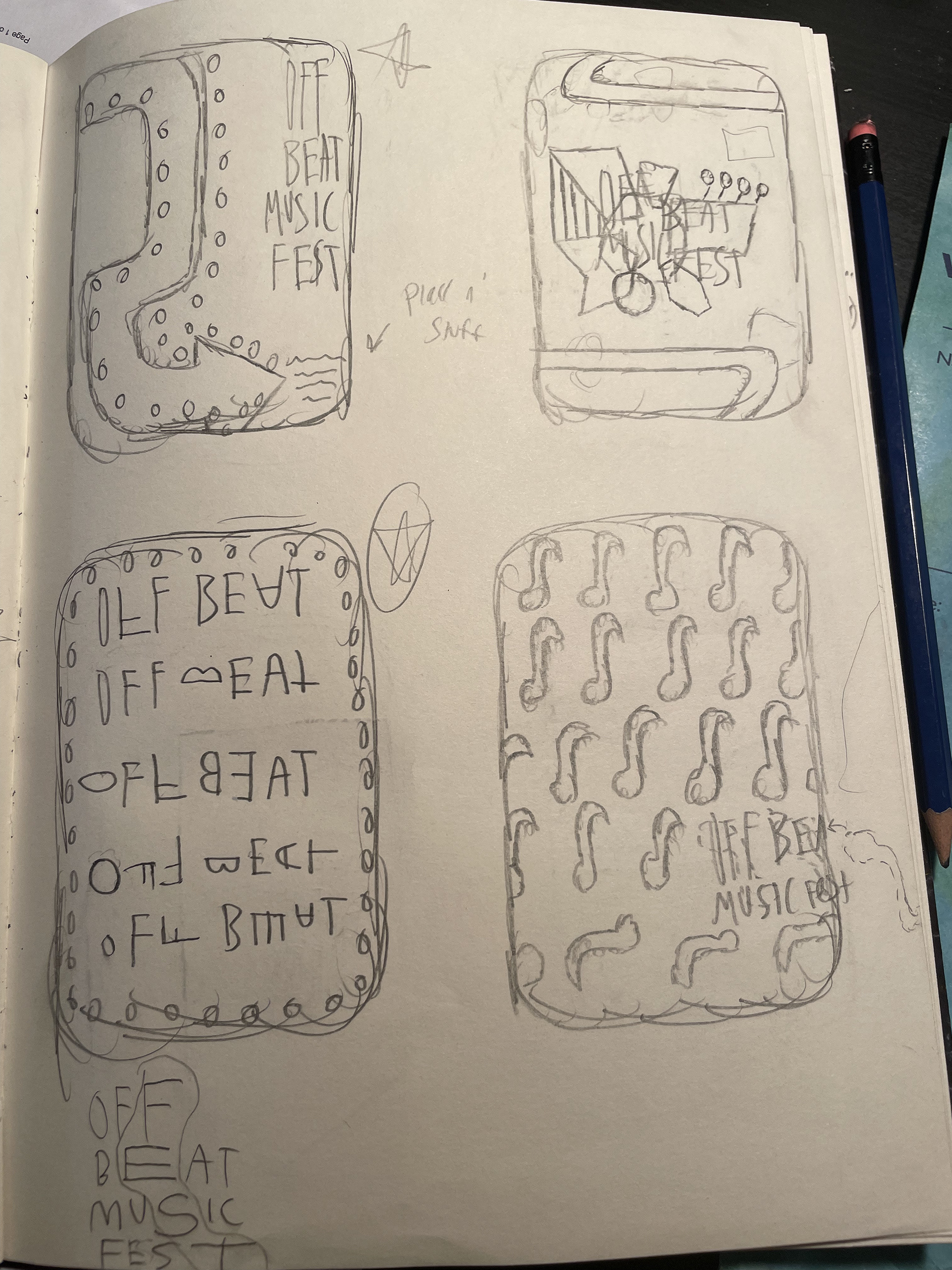

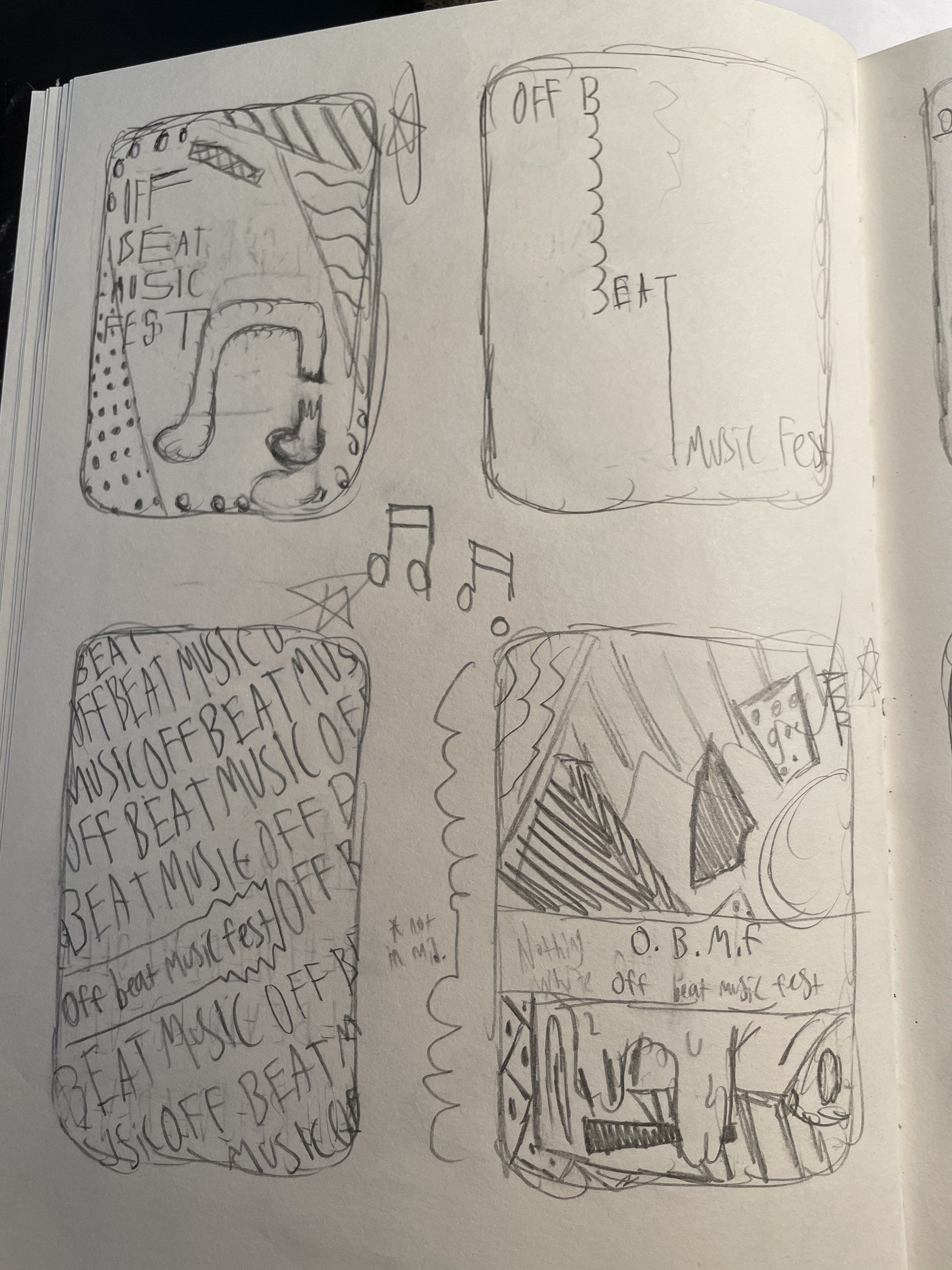
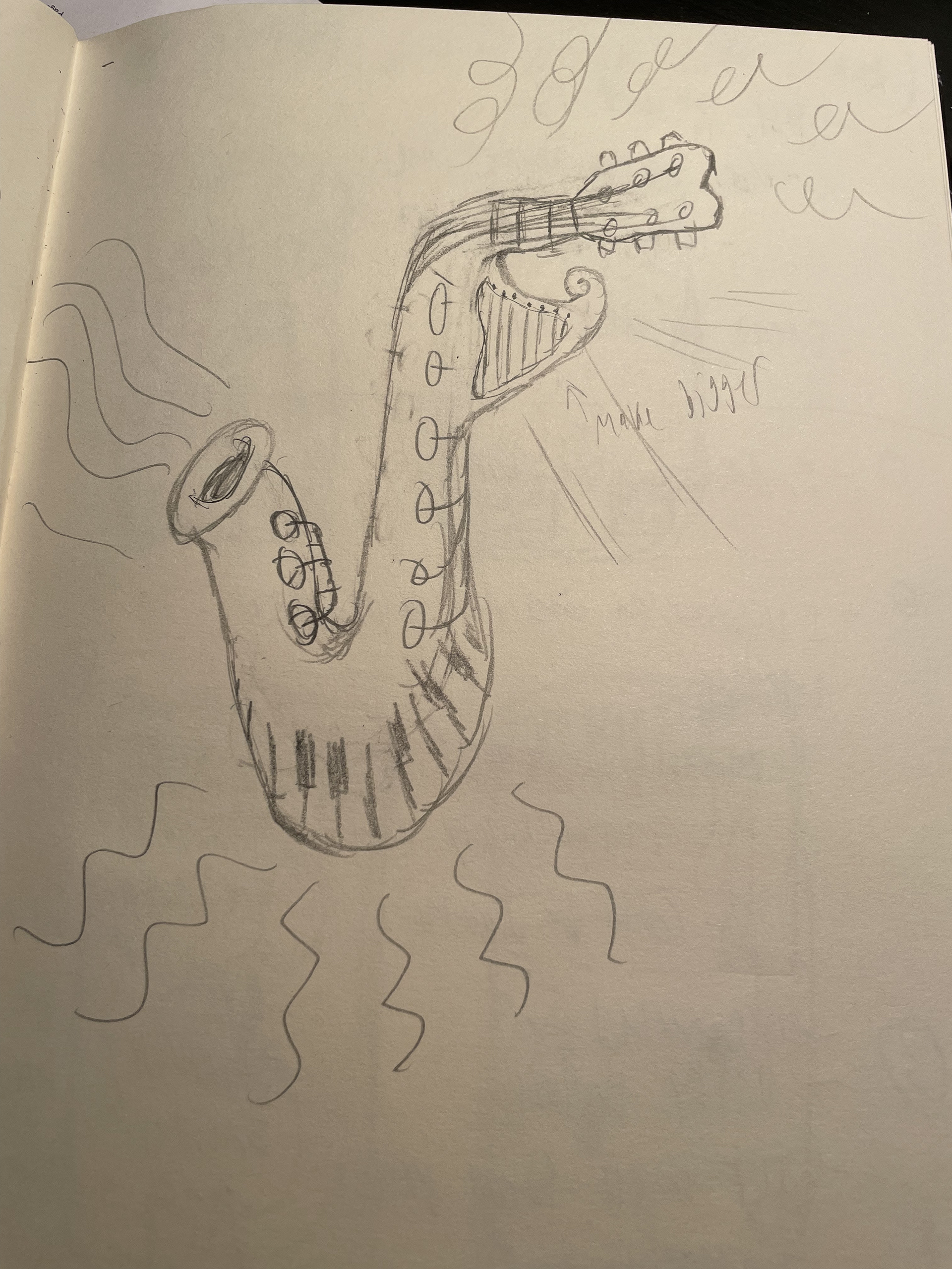

Ideation and sketching for the poster was a scatterbrained process revolving around trying many different approaches, be it typography-focused, image-based, etc. This allowed me to kind of figure out what approach was working and which wasn't and what aspects I could take from failed approaches to inform new approaches.
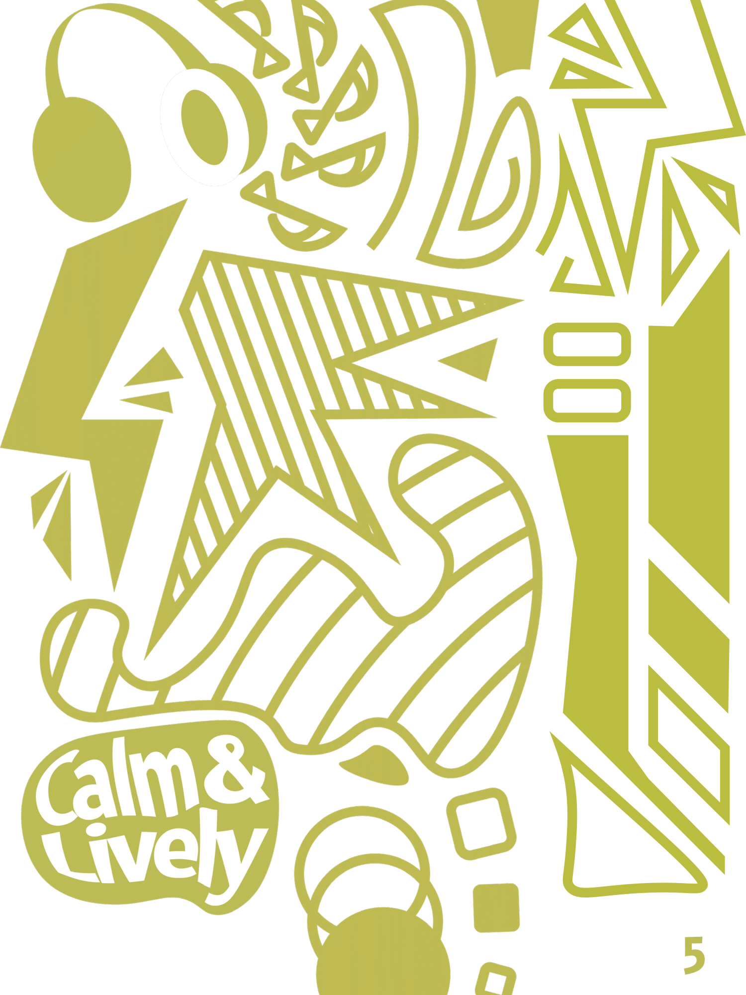
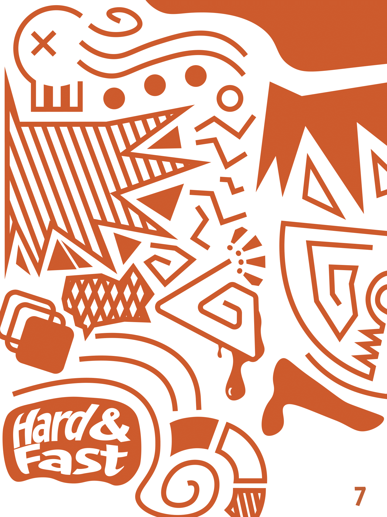
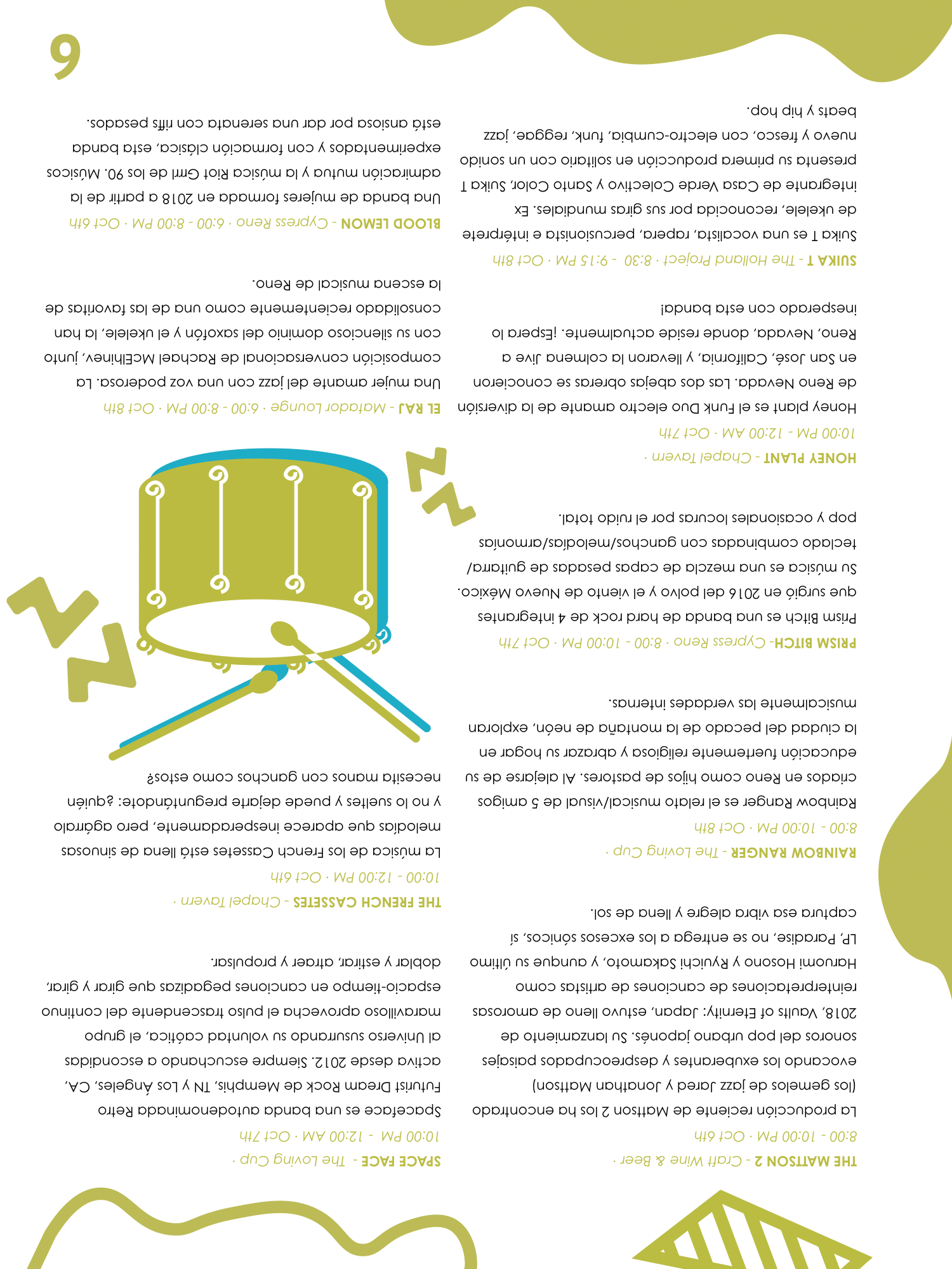
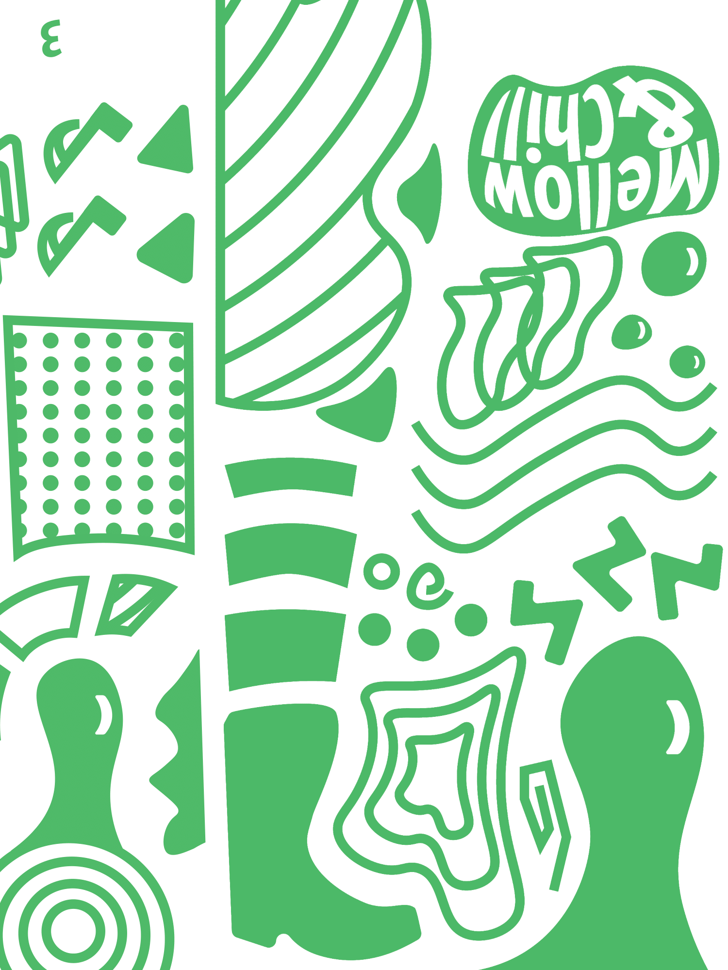
The poster ended with a very graphical feel, utilizing a marker-felt aesthetic. I recognized that the festival was more of a local deal, which led me to use various artifacts from midwest cliches like cowboy boots, skulls, as well as arrows and circles, derived from Nevada's famous neon signs. The use of multiple different artefacts created a pseudo-collage feel that aimed to bring attention to the multiple genres and bands playing; each band and song is unique, much like each individual illustration. This style would inform the rest of the assignment's feel.
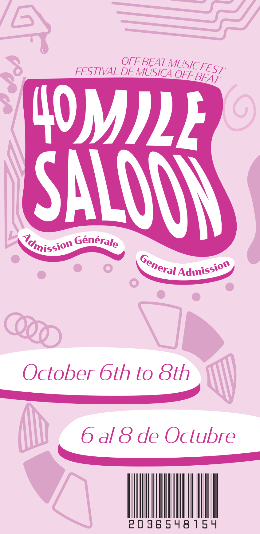
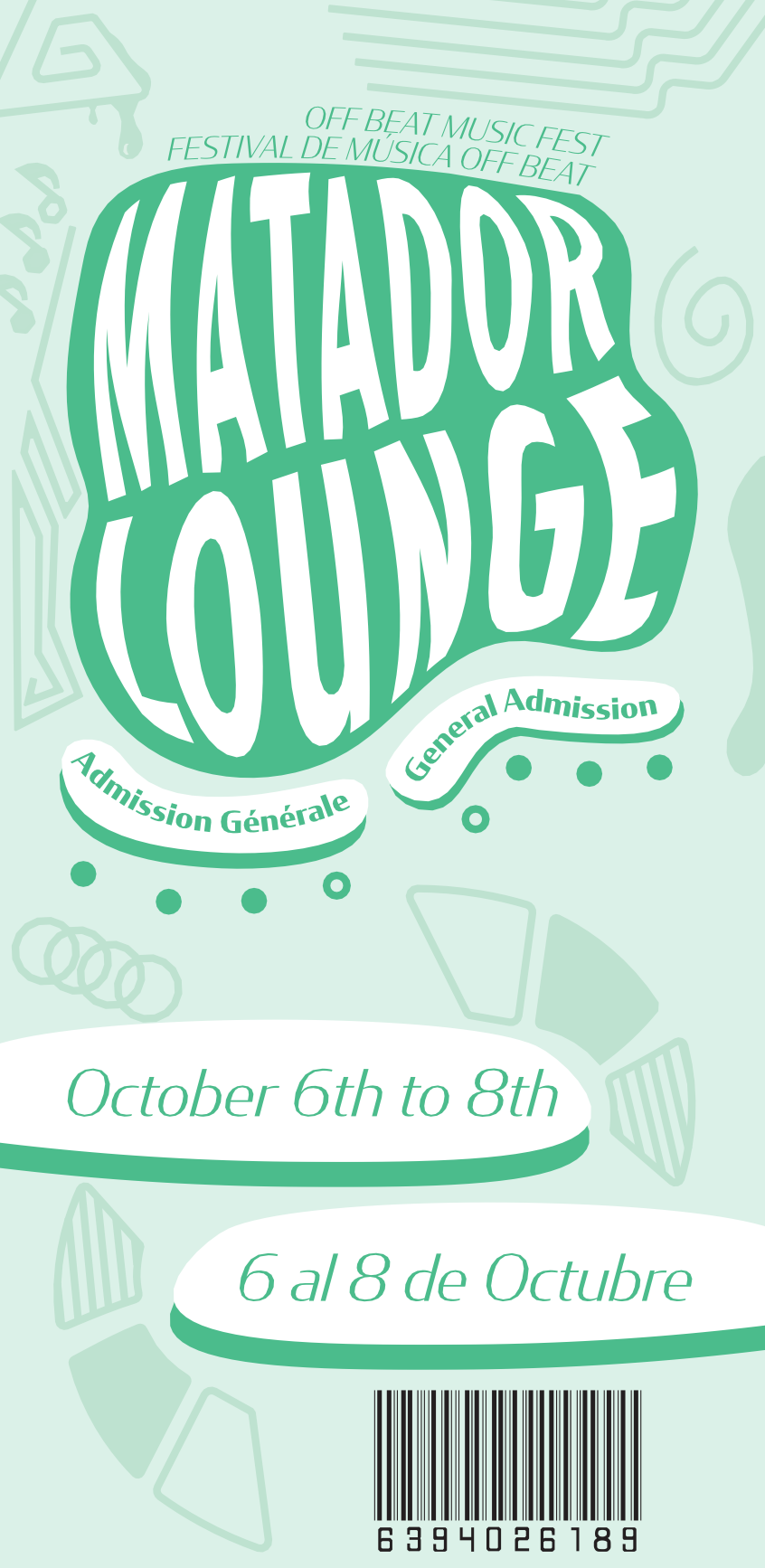
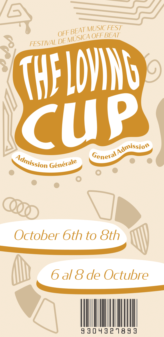
Finished e-tickets.
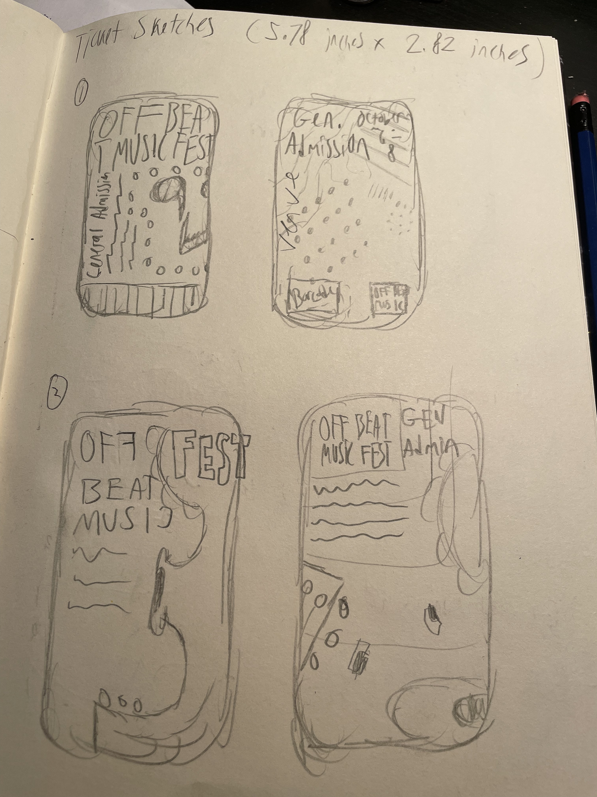

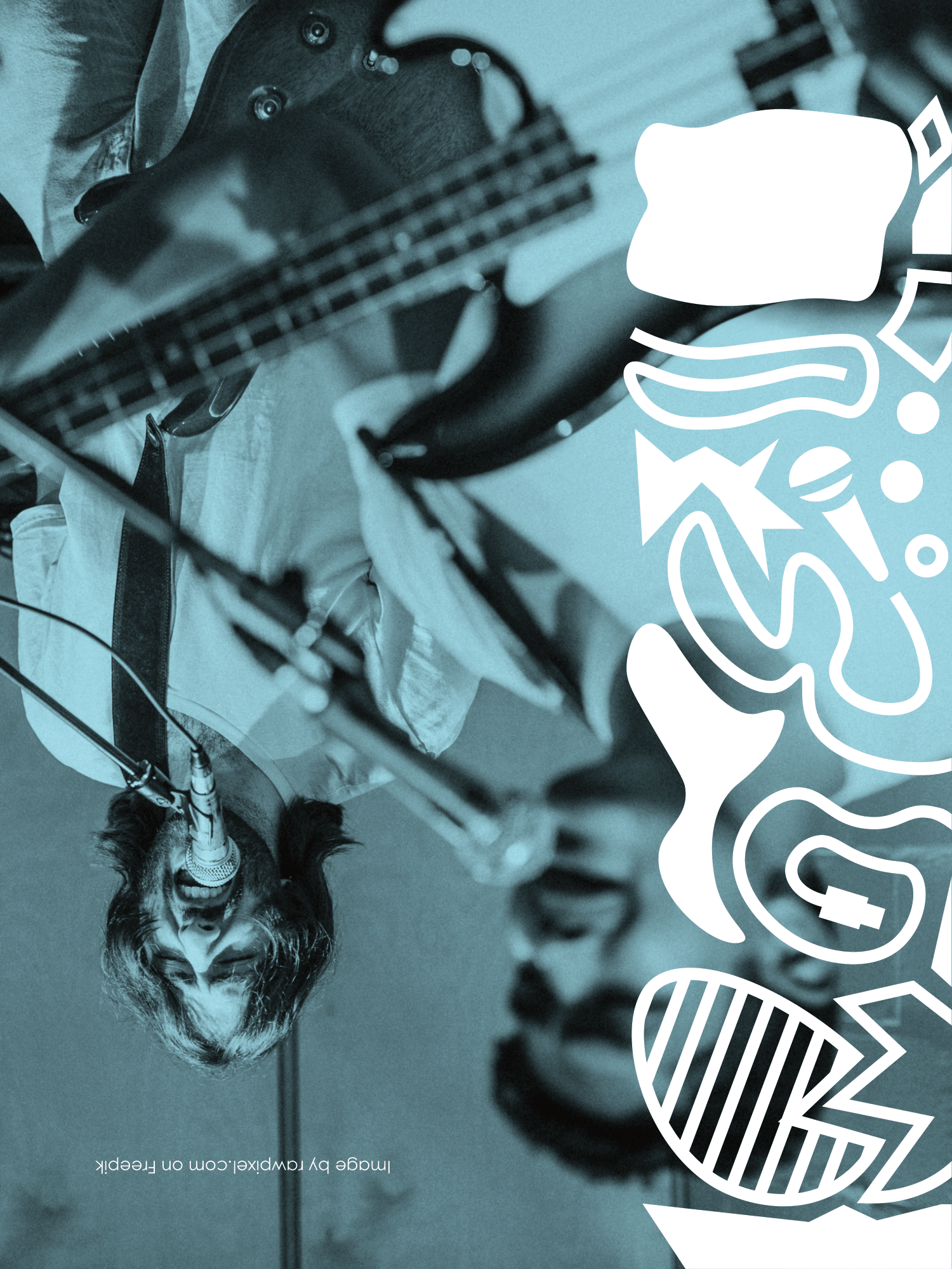
Using motifs from the finished poster fed the designs for the event's e-tickets, as well as utilizing previous ideas from past sketches, allowed for a consistent theme and style.


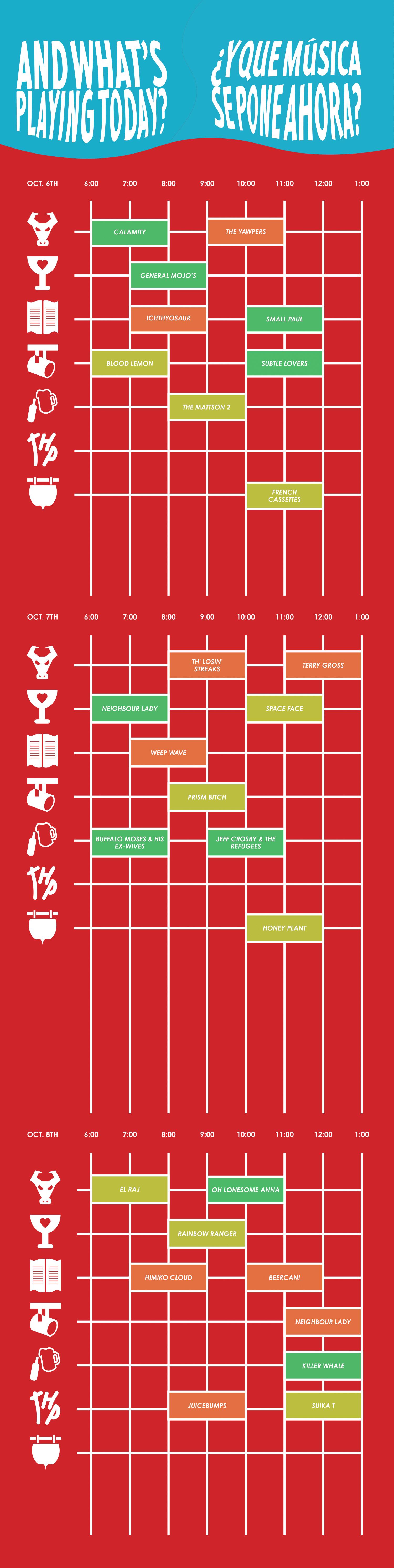
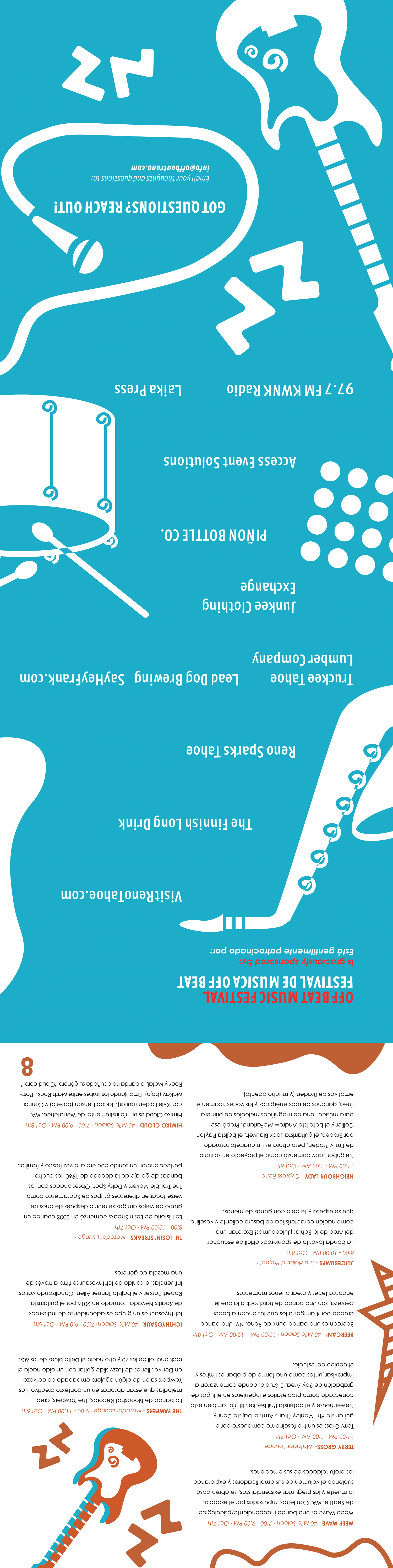
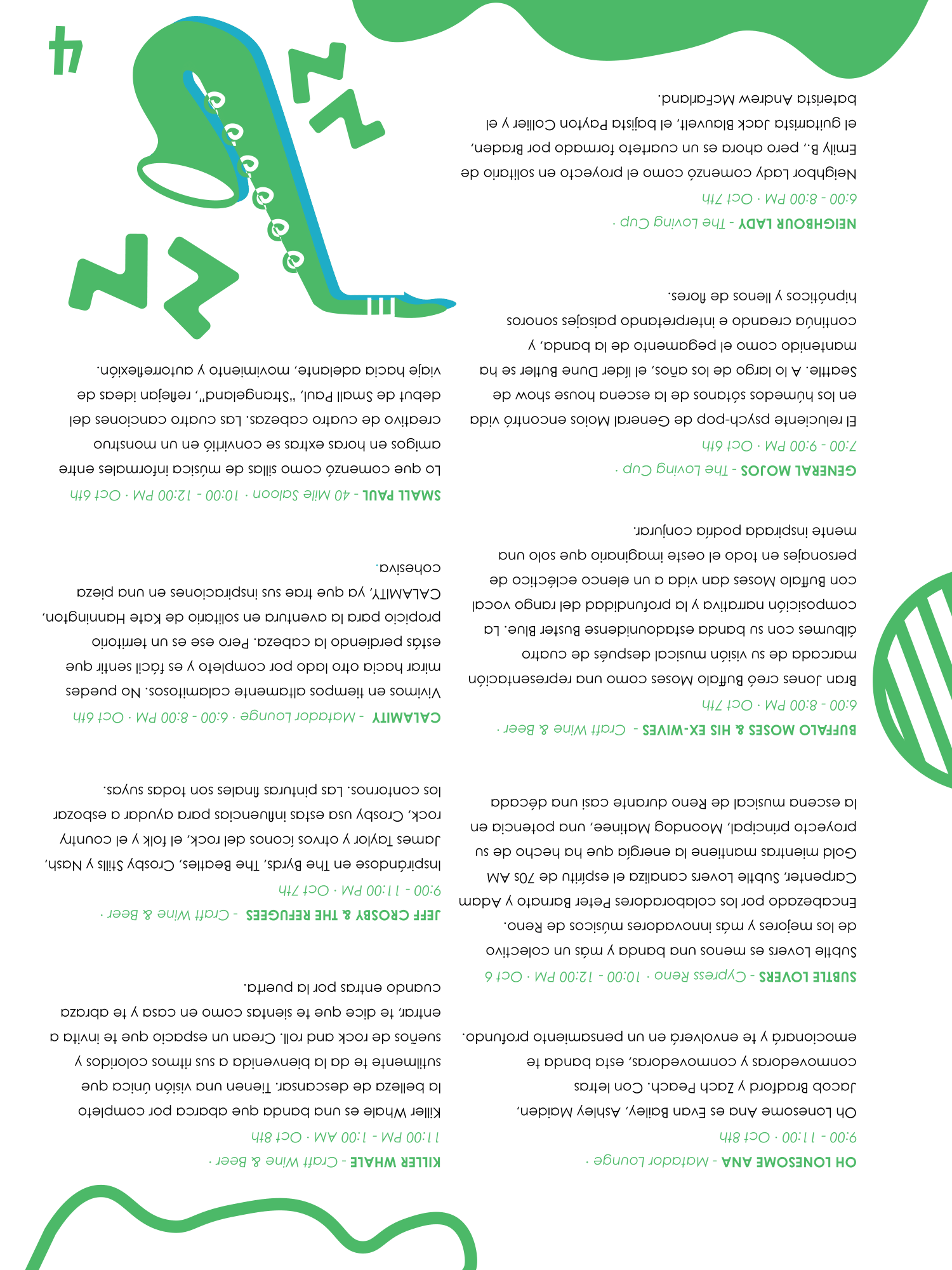
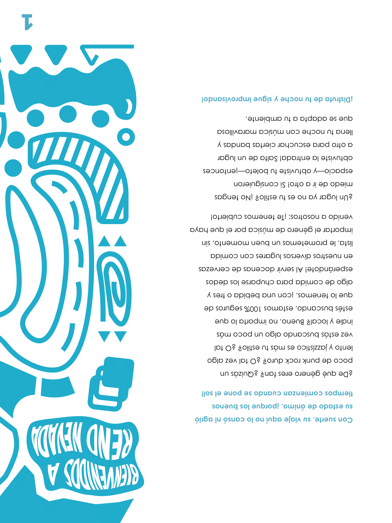
The final booklet ended up being a reversible booklet, one side in in English, and the opposite side—upside down—supporting Spanish, the second most prominent language spoken in Reno, Nevada.
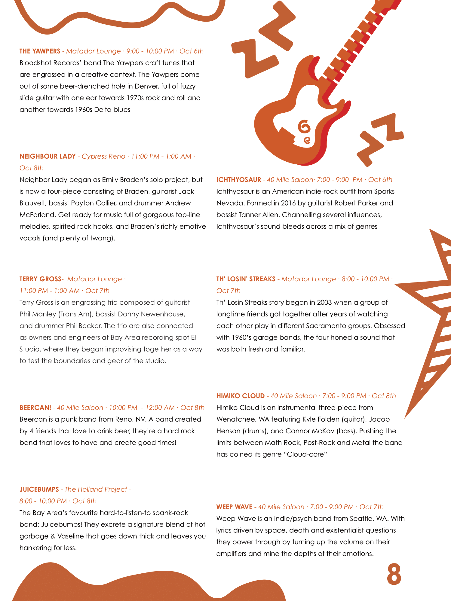
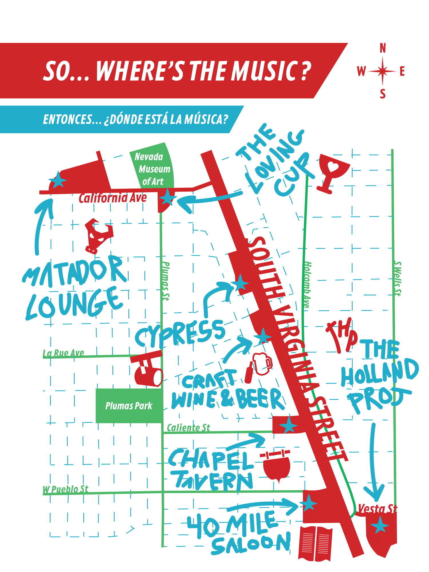
Further, the middle of the book folds outward to reveal a map, set times, and sponsors. Performing artists and bands are separated into categories, distinguishing between loud and fast-paced music, slower, mellow music, a music in the middle ground between both categories. This imperative information allows visitors to cultivate their day with their preferred soundscapes, further allowing them to find others who prefer the same.
Blending the swirling graphics of the e-tickets and poster with informationality, while further reusing the red-blue duotone to separate English and Spanish sides, the book effectively communicates everything needed for festival-goers. English and Spanish sides, the book effectively communicates everything needed for festival-goers.