

This assignment tasked me with reimagining a book cover of my choosing, one image-based and one text-based. I chose William Golding's Lord of the Flies, a book that has always been one of my favourites due to its intriguing themes. I knew that if i was to tackle this book, I needed to closely reflect these ever so important themes.

Image-Based
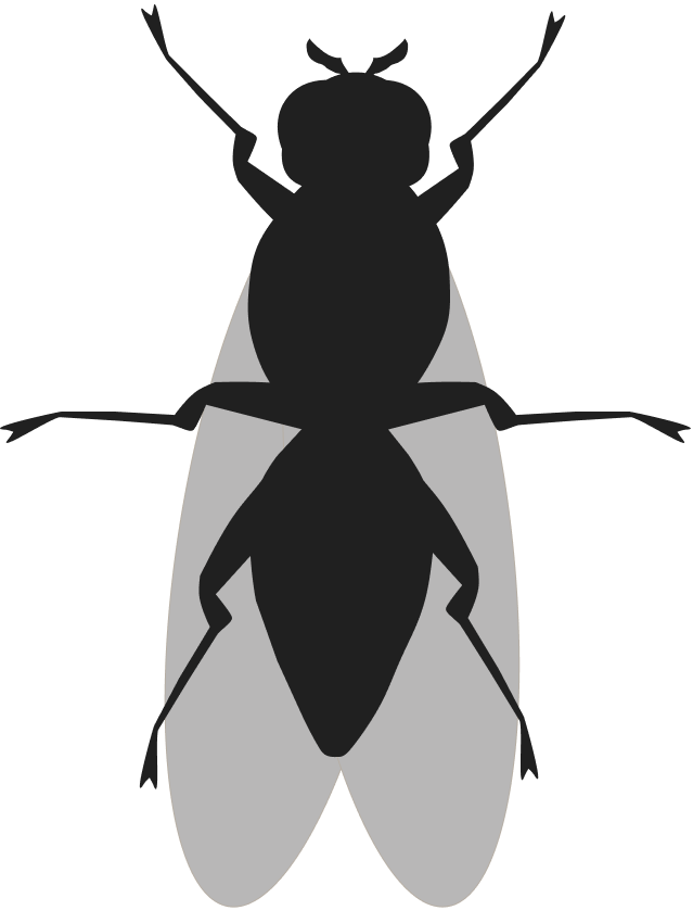
I didn’t want to use the pig imagery due to it’s over saturation in covers of the book, which led me to the fly, which also lead me to the word “lord” in the title. Lord, as in, a fly that rules above all others. It stands out among them. This lead me to use the idea of a wallpaper-esque background, but to my advantage to make one fly stand out. My design is trying to utilize fly imagery in a unique way to grab the viewer’s attention. A spray painted-esque crown atop a glowing, deified, frenzied fly stands atop the others, the lord of them all.

A text based cover
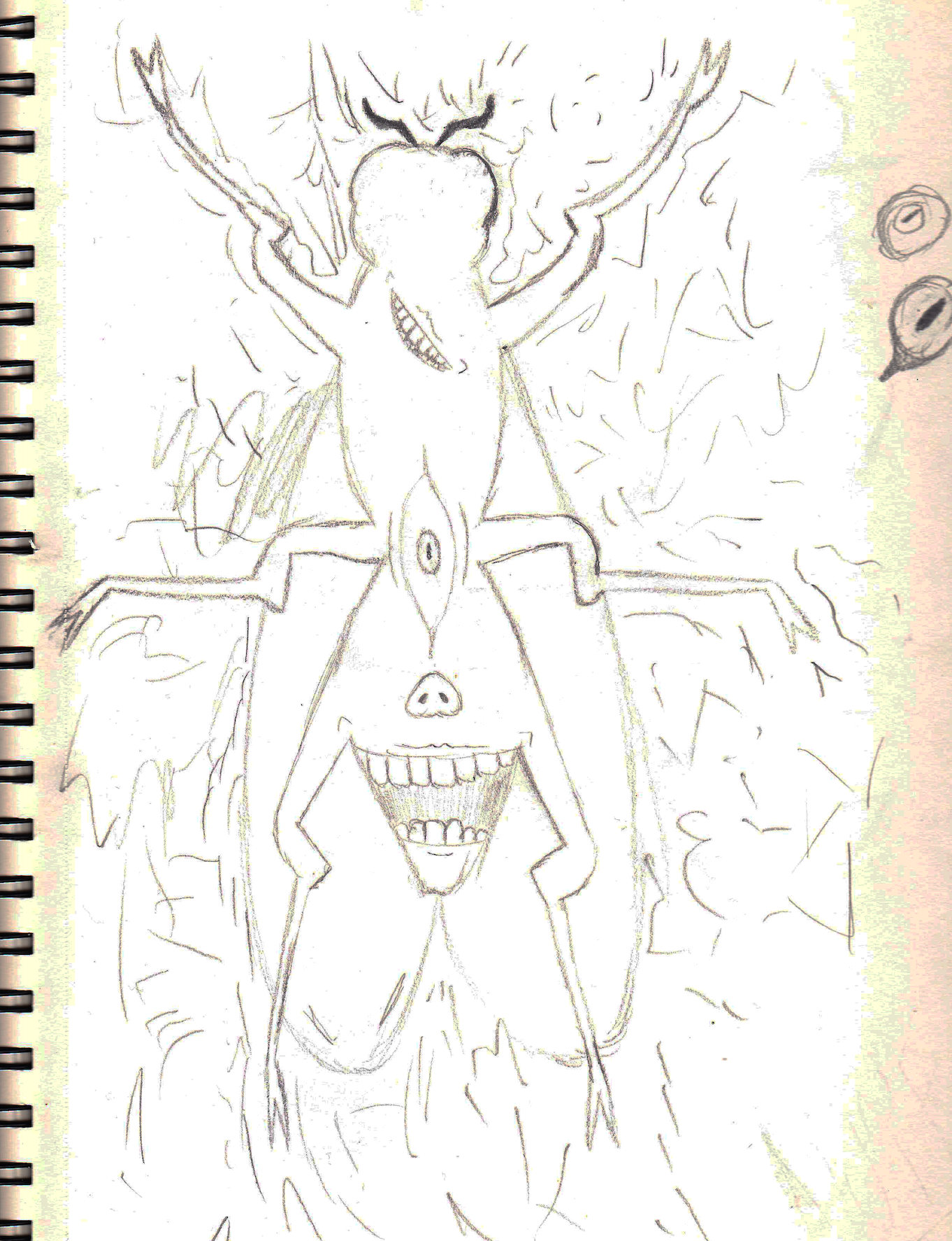
Initially, I wanted to use realistic human imagery juxtaposed onto a fly similar to a collage, but I was not amicable of the results early on. I wanted to display one of the themes in the book, harmony/order amidst chaos, visually. This lead me to use sketchy lines and clean illustrator forms to do so. What I was trying to achieve was a sense of contrast that also reflected the book’s main themes, an idea you'll see in both covers.