
MÜNBLÜM is a branding design project which called upon me to design a logo and supporting brand elements for a company of my own creation and then, over the course of a term, create a printed branding guideline book.
Although starting as a research group project focused on the floral industry, MÜNBLÜM took on a life of its own as an individual endeavour as a narrative-driven, eco-friendly "astro-florist" entity that creates specially made plants meant to look weird, fantasy-like, and even a little scary.
The assignment first entailed the creation of a logo, followed by a brand colour-scheme, as well as supportive fonts and their uses cases. Following this, the brand was expanded upon into a launch campaign, titled THE INVASION FROM MARS.


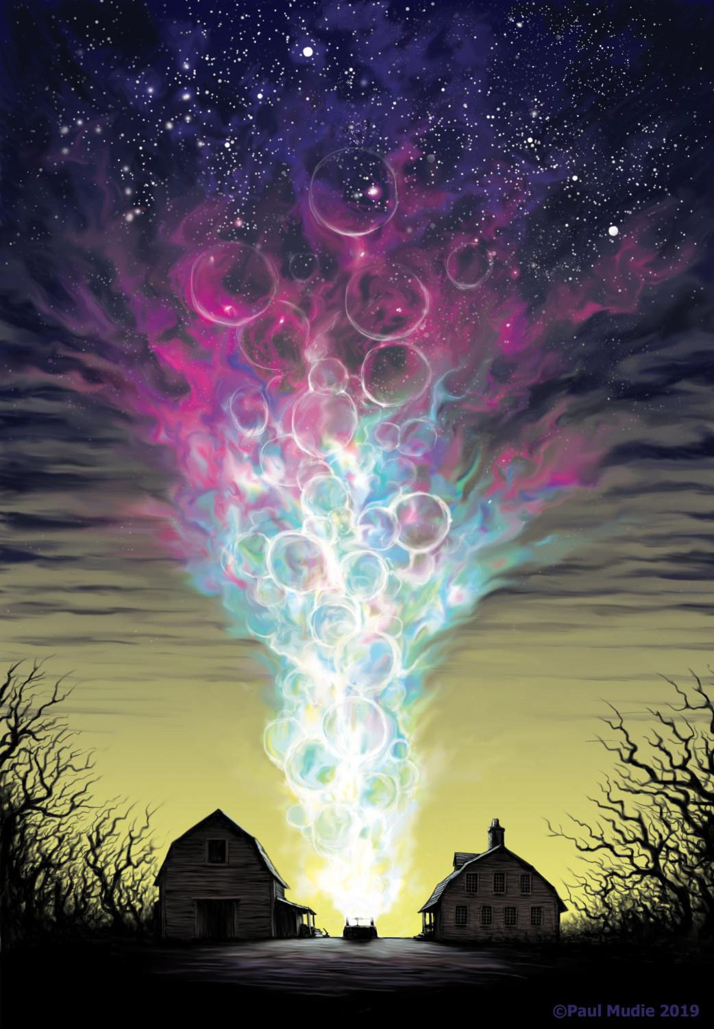
Ideation began by exploring numerous options, by playing with eldritch, space-fantasy imagery. Colours and ideas often associated with space horror/lovecraftian media (tentacles, teals, magentas, etc) served as large sources of inspiration


After a central idea for a logo was made, iteration and a palette was quickly expanded upon, with variations like a text-based logo or a dynamic, interchangable version that can be endlessly tweaked for company endeavours
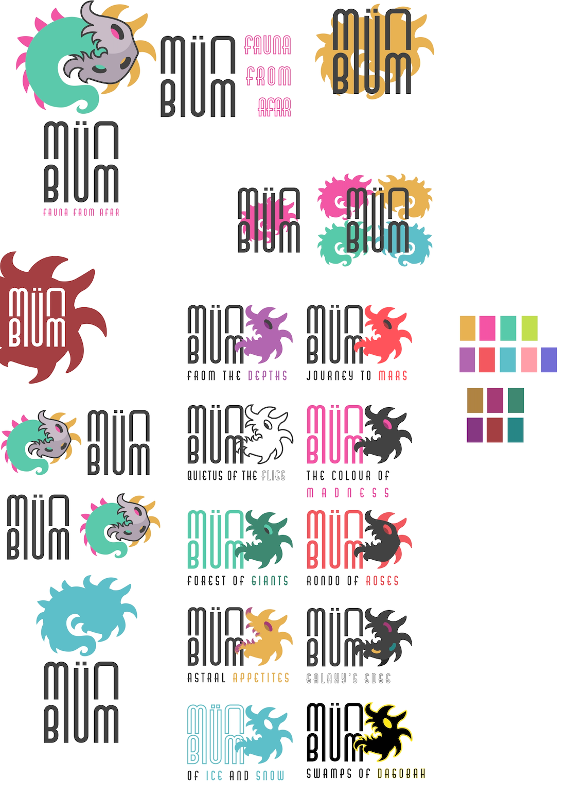
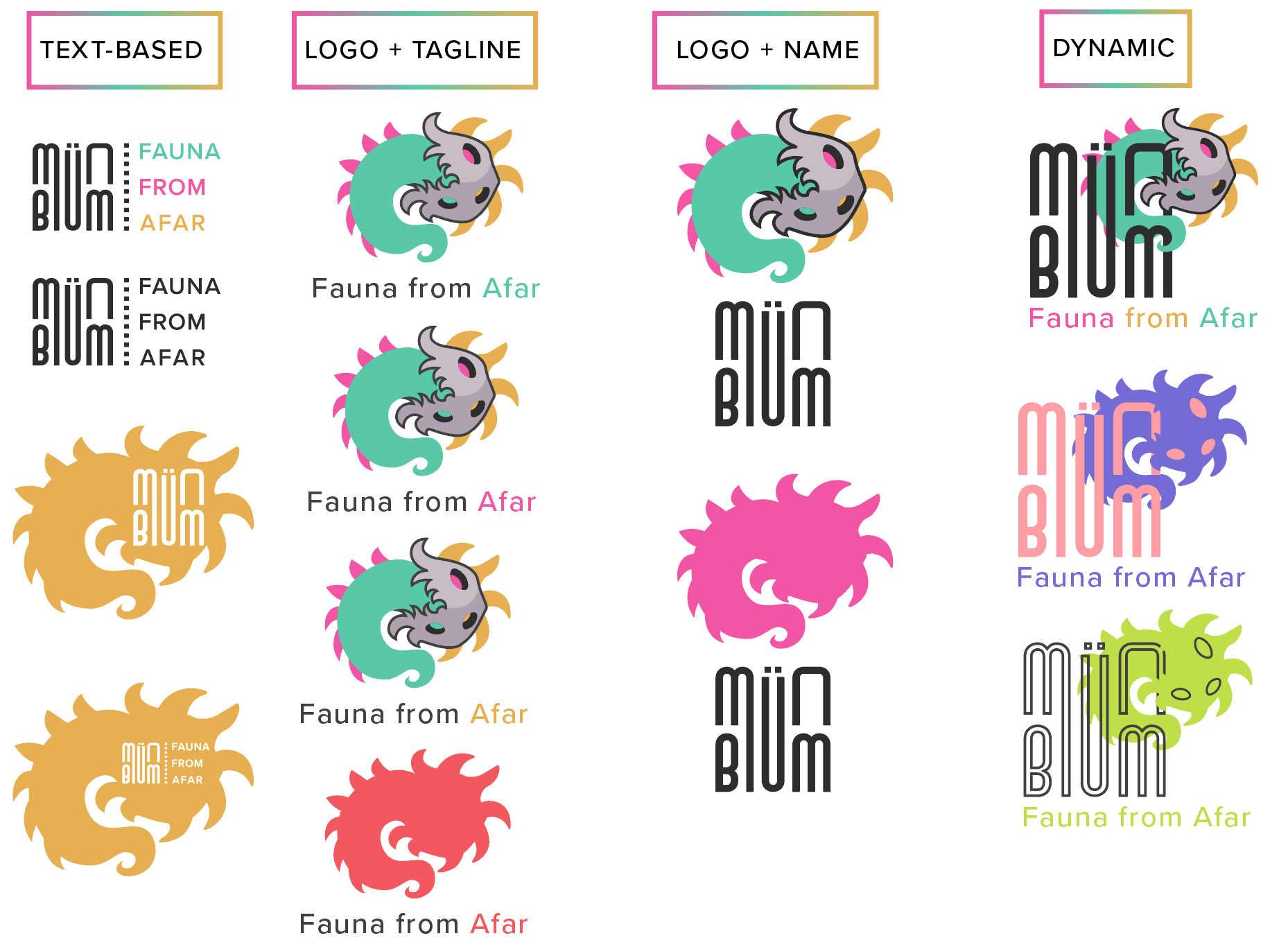

The tagline, Fauna From Afar, was created to supplement the use of a bizarre looking creature-based logo; the complex design of the logo allows for, despite its many spikes, to be used to facilitate a variety of future company expansions and releases for a variety of astral/fantasy themes:
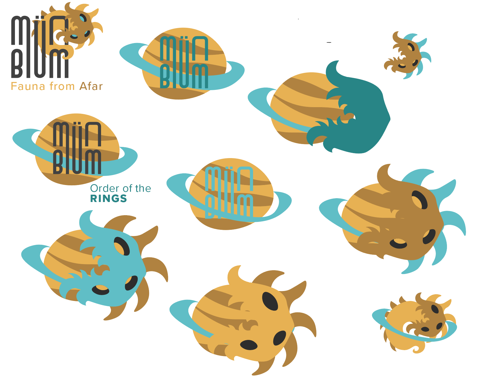
A more jovial set release of specially made, artificial plants from a lush, tropical speculative planet might be named: MÜNBLÜM: Worlds of Bounty.
A theme of released "plants" relating to a tundra world might be called MÜNBLÜM: Of Ice and Snow.
A deeply dramatic, narrative theme focused on horror and fear might be called MÜNBLÜM:Fear and Hunger.
The dynamic use logo in particular facilitates all of these ideas, and many more by replacing a specific part of the logo with a specially made graphic, and replacing the tagline with the expansion's memorable name.

Ideation for what the expansion would be involved a brief look into available, recognizable planets to facilitate a more concrete theme. The theme, to be in line with the "space fantasy/space horror," would have to be equally as fantastical in naming. A theatric approach to naming and company speak would become the hallmark for MÜNBLÜM.
An idea of a sacred order of plants from Saturn dubbed "Order of the Rings" was considered, but was ultimately beat out by THE INVASION FROM MARS, an expansion campaign telling of a secret invasion of plants from Mars, with popup shops around the GTA.


With a campaign set in motion, ideation on an expanded style of "plant characters" to use as stand-ins for what products could look like begun, as well as sketch work for the advertisements and what they could look like, ranging from Billboards, poster ads, building wrapped ads, instagram ads, and more.
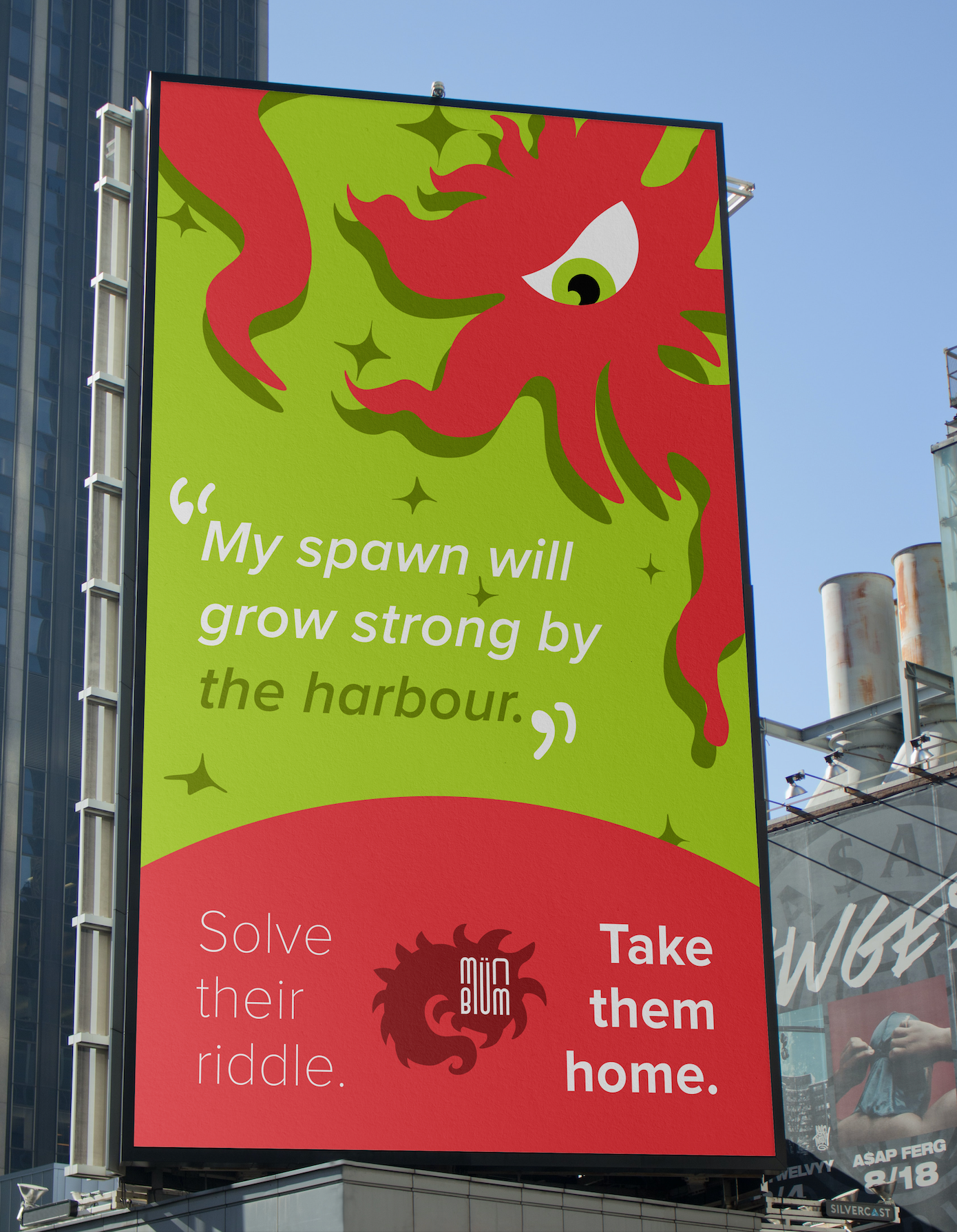

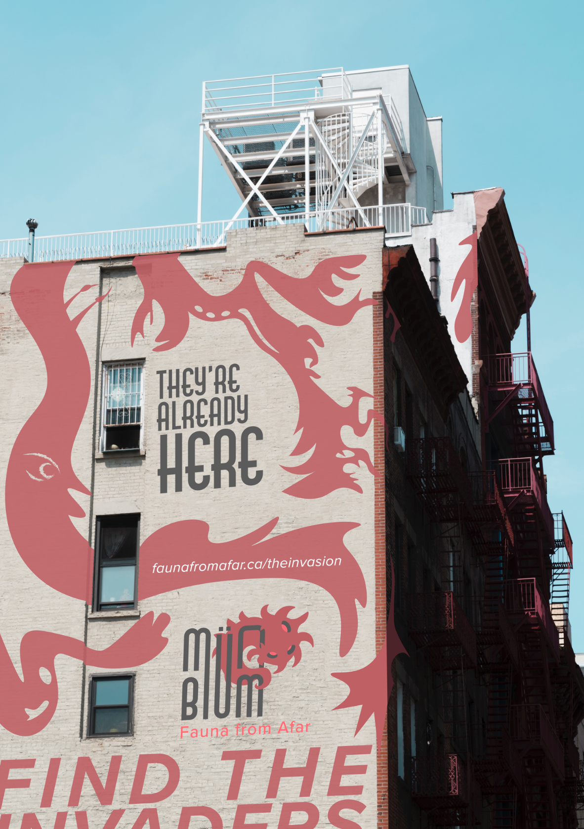
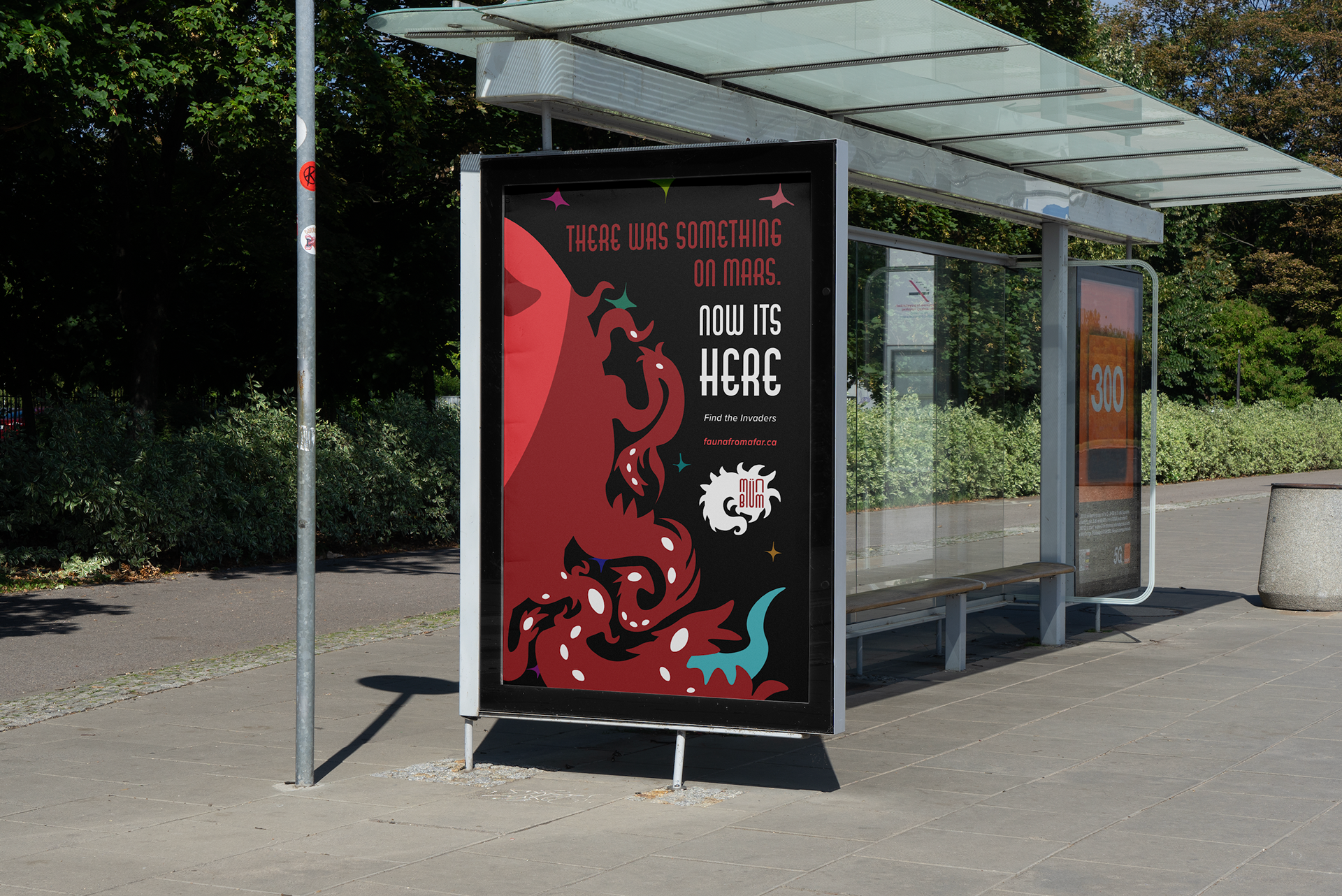
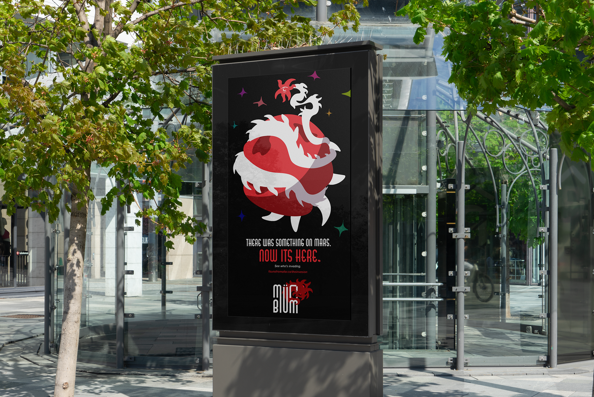

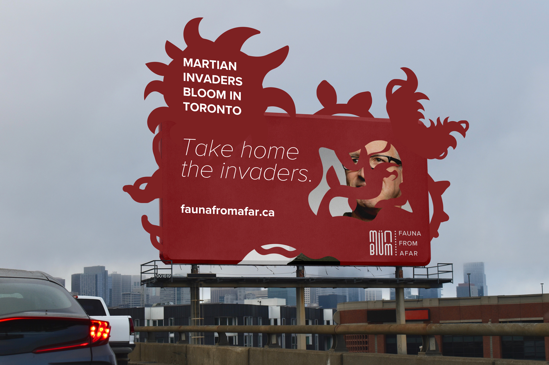
An assortment of advertisements were made for the launch campaign, centring on its use of #F1595E, The Red Planet, a specific red in the brand's secondary palette, and the use of vague, intriguing verbiage.
These billboards and posters would be placed around the city of Toronto, drawing people to certain places to see MÜNBLÜM popup shops, giving the idea they are finding aliens around Toronto. An Instagram advertisement would be used to spread awareness of the launch campaign and brand.
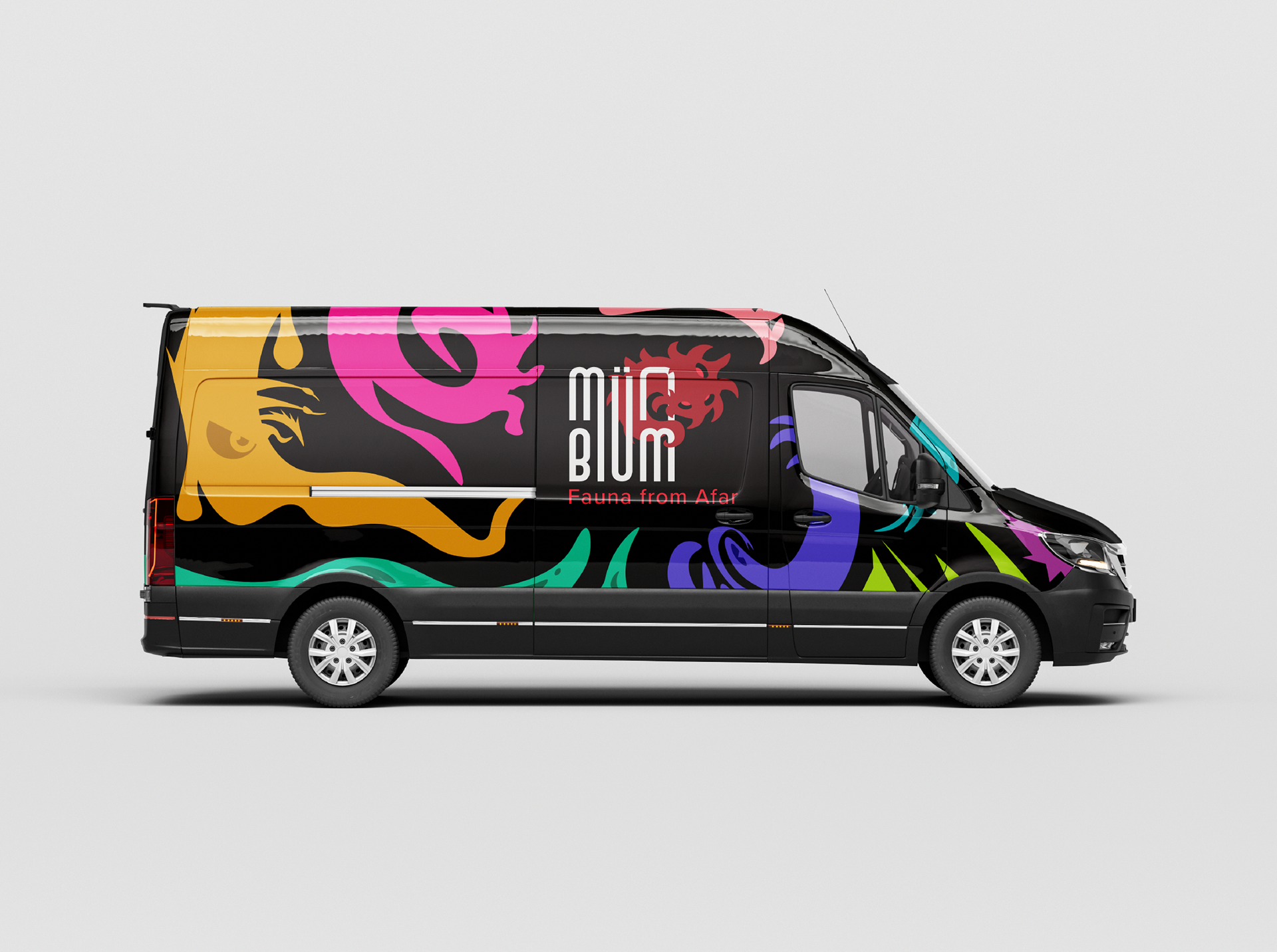
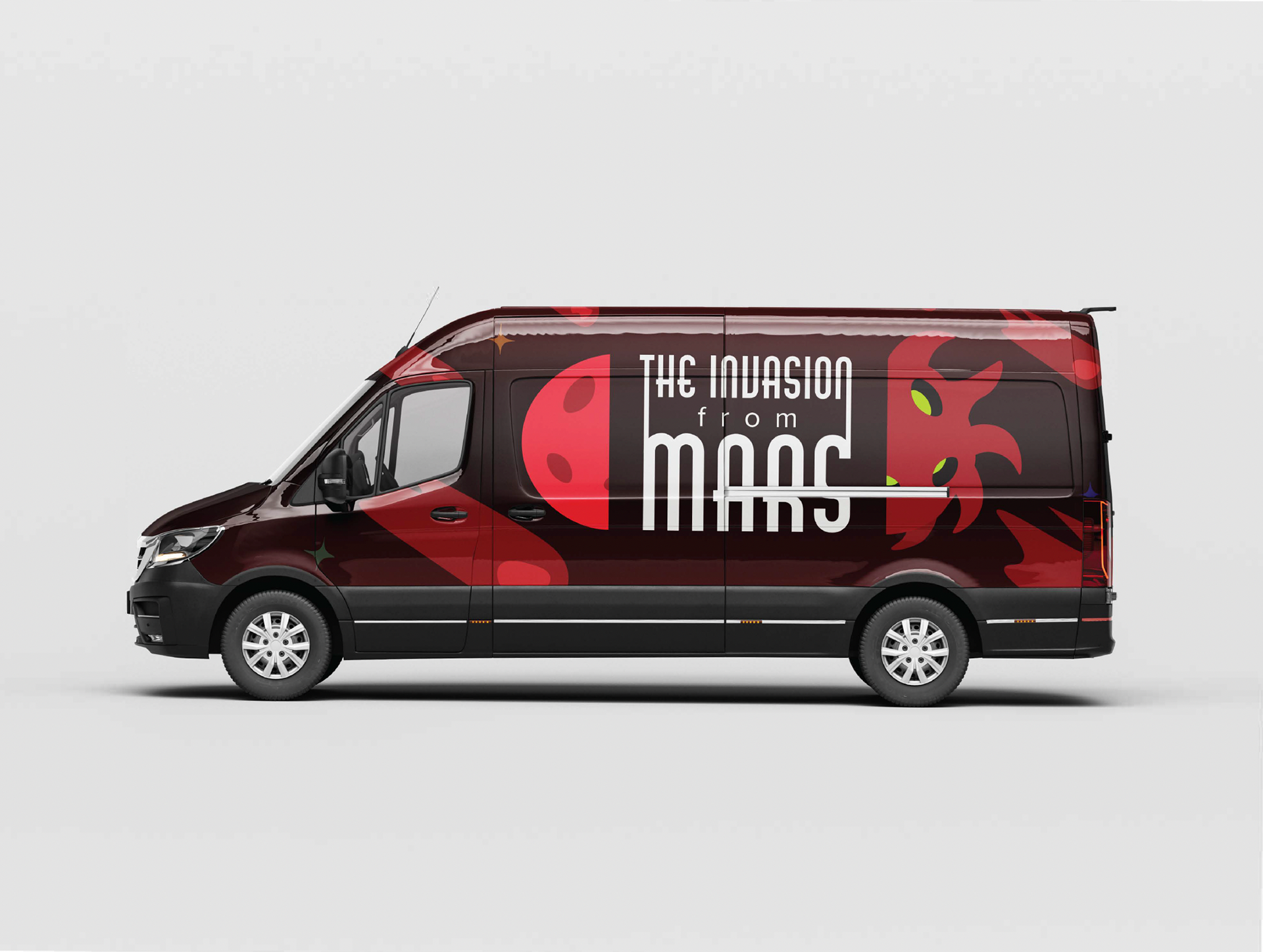

These billboard ads would spread awareness and lead viewers to specific spots (My spawn will grow strong by the harbour = Harbourfront, for example), where one of these trucks would be waiting with special MÜNBLÜM merch that can't be purchased online.
One side of the truck utilizes all the colours of the palette, while the reverse side uses a special launch campaign use logo, with advertisements and teasers that tell the story of just how these plants came to be...
Advertisements like the animation above would draw intrigue, while employees and other sources would drum up the story further.

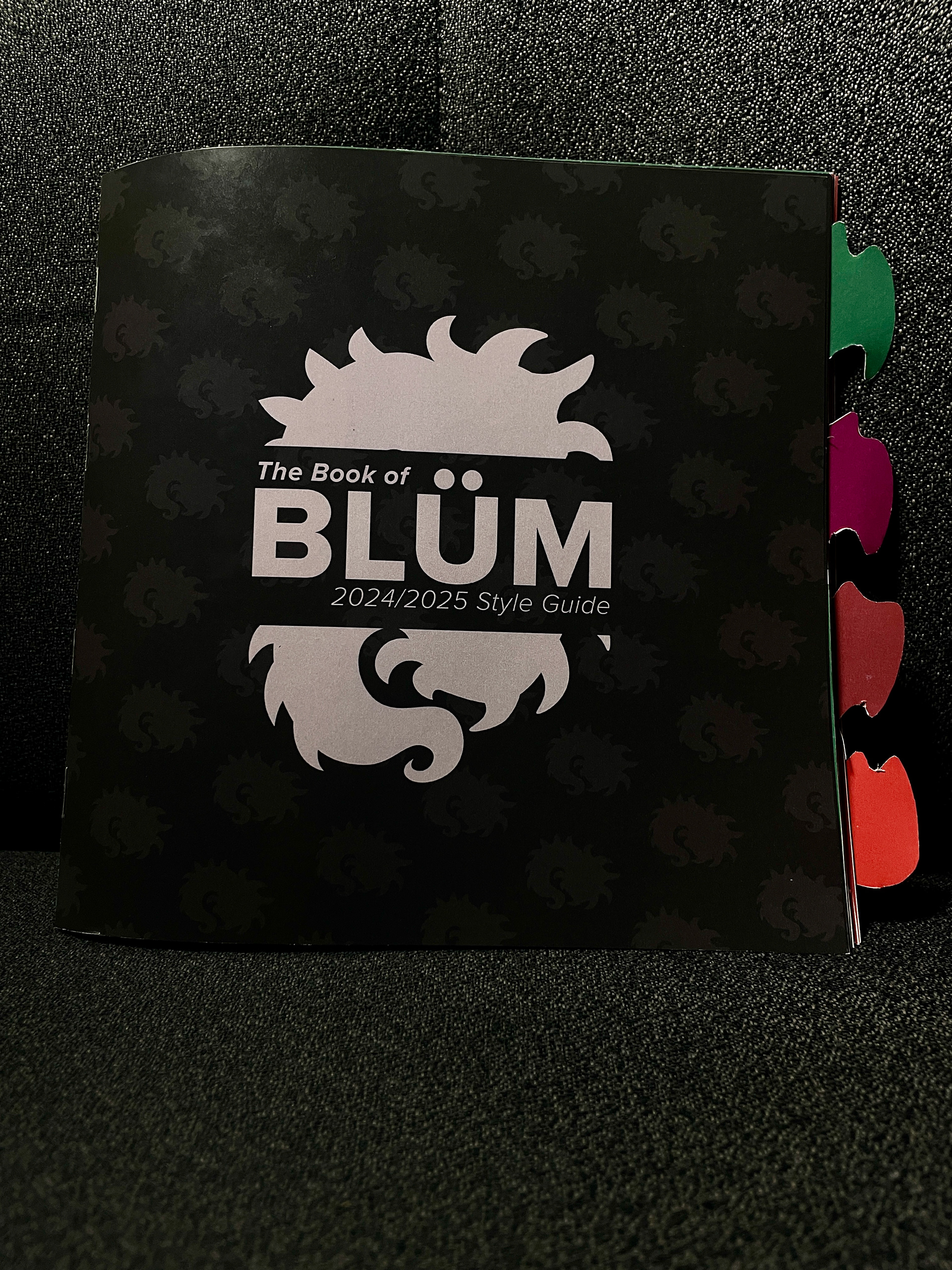

The Book of BLÜM - 2024/2025 Style Guide
Once advertisements were made for MÜNBLÜM and its launch campaign, the final booklet containing the style, introduction to MÜNBLÜM as a company, logo guide, and launch campaign guide could be compiled.
At this point in the process, things like the palette and different logos were well documented. However, the booklet will model how to use them, how not to use them, while highlighting how they benefit MÜNBLÜM image as a corporate entity.
The pagination involves an Introduction, where MÜNBLÜM introduces itself, provides the three supportive pillars it builds itself upon, and describes its visual and narrative direction.
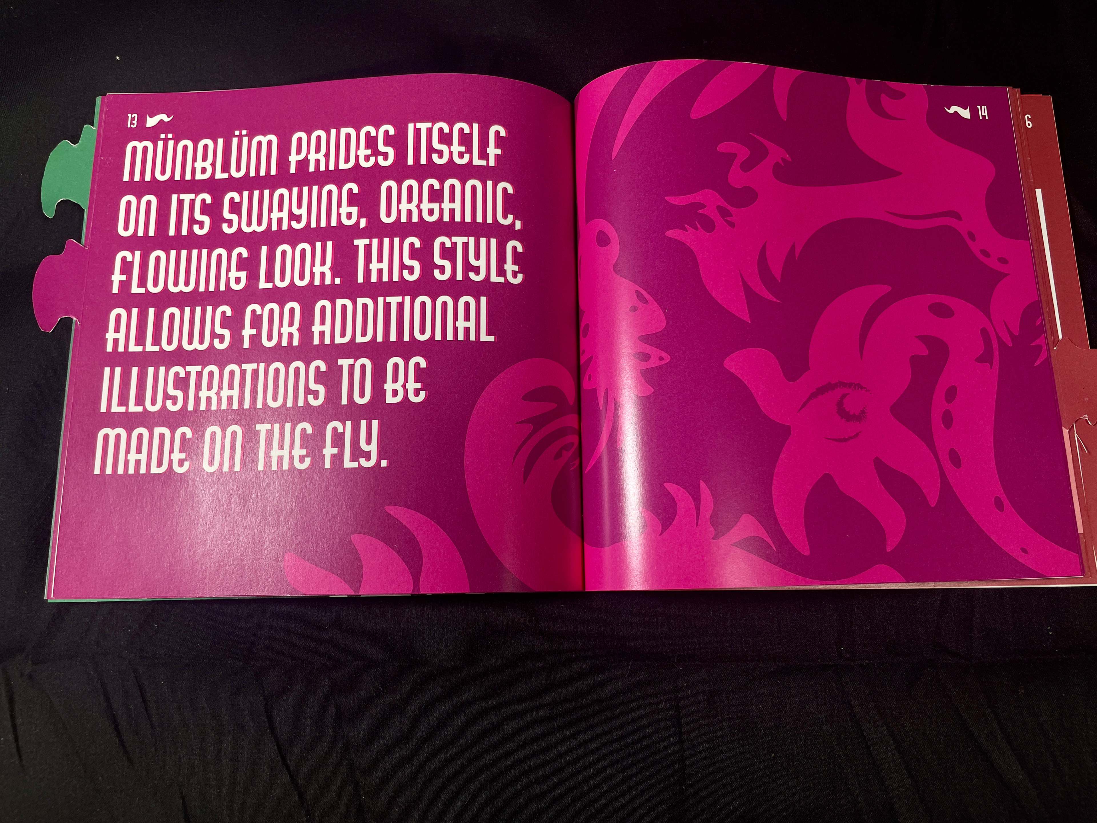
This is followed by a Style guide, which introduces the flowing visuals and how to create it and new characters on the fly. Continuing this is the Logo section, which gives all the use cases for each of the logos, and where they are best applied, and how to expand on their use. Finally, the Launch Campaign details the riveting astral tale of THE INVASION FROM MARS, and describes the specially chosen logos to use for the campaign, while showcasing all the advertisements made for it.
Below you will find the full pagination:


This assignment has been, to date, one of my favourite assignments I have ever worked on. Space, fantasy, and science-fiction are all genres, both literary and in visual media, that I heavily enjoy, and I am truly grateful I got the chance to work on an assignment such as this.
The course that had me work on this was my Foruth-Year, York University: Branding And Identity Systems, directed by the fabulous Marija Bacic, of whom I have nothing but good things to remark on.
Deciding every little in-and-out for a company and forming their identity from scratch was a truly fruitful endeavour in every sense, and I will hold this project close to my heart for years to come.


Although not necessary for the assignment, I did enjoy being able to print out a makeshift version of one of MÜNBLÜM products, Caduceator Agarthus, which translates roughly to The Herald of Agartha. This would be the general naming convention plants sold by the company would have, to further their weirdness with a Latin name.
That is their name, I just call them Gerald. Gerald's quite photogenic, aren't they?